Branding and Identity Design
Type: Classroom Project
Brand Identity | Rebranding | Visual Design | Social Impact | Communication Design
Rebranding an Educational Nonprofit: Samridhdhi Trust
A rebranding effort to reflect the nonprofit’s mission of making education more accessible for children from vulnerable communities.
Role: Brand Identity Designer, Collateral Design (Solo Project)
Tools used : Illustrator · Photoshop · InDesign · Figma
Duration: 3 weeks · 2023
Branding and Identity Design
Type: Classroom Project
Brand Identity | Rebranding | Visual Design | Social Impact | Communication Design
Rebranding an Educational Nonprofit: Samridhdhi Trust
A rebranding effort to reflect the nonprofit’s mission of making education more accessible for children from vulnerable communities.
Role: Brand Identity Designer, Collateral Design (Solo Project)
Tools used : Illustrator · Photoshop · InDesign · Figma
Duration: 3 weeks · 2023
Branding and Identity Design
Type: Classroom Project
Brand Identity | Rebranding | Visual Design | Social Impact | Communication Design
Rebranding an Educational Nonprofit: Samridhdhi Trust
A rebranding effort to reflect the nonprofit’s mission of making education more accessible for children from vulnerable communities.
Role: Brand Identity Designer, Collateral Design (Solo Project)
Tools used : Illustrator · Photoshop · InDesign · Figma
Duration: 3 weeks · 2023

About Samridhdhi
Samridhdhi Trust, meaning 'prosperity' or 'welfare,' is a non-profit social change organization dedicated to empowering out-of-school children of migrants in Bangalore, Pune, and Delhi NCR.
The organisation's primary objective is to help children engaged in activities such as rag picking, household chores, sibling care, drug abuse, violence etc, access education and guide and support them from a 'school-ready' stage to a 'job-ready' stage.
In line with this goal, this project aimed at ideating an alternative brand identity for the organisation that is compelling, easily recognizable, and effectively communicates its values and missions.
About Samridhdhi
Samridhdhi Trust, meaning 'prosperity' or 'welfare,' is a non-profit social change organization dedicated to empowering out-of-school children of migrants in Bangalore, Pune, and Delhi NCR.
The organisation's primary objective is to help children engaged in activities such as rag picking, household chores, sibling care, drug abuse, violence etc, access education and guide and support them from a 'school-ready' stage to a 'job-ready' stage.
In line with this goal, this project aimed at ideating an alternative brand identity for the organisation that is compelling, easily recognizable, and effectively communicates its values and missions.
About Samridhdhi
Samridhdhi Trust, meaning 'prosperity' or 'welfare,' is a non-profit social change organization dedicated to empowering out-of-school children of migrants in Bangalore, Pune, and Delhi NCR.
The organisation's primary objective is to help children engaged in activities such as rag picking, household chores, sibling care, drug abuse, violence etc, access education and guide and support them from a 'school-ready' stage to a 'job-ready' stage.
In line with this goal, this project aimed at ideating an alternative brand identity for the organisation that is compelling, easily recognizable, and effectively communicates its values and missions.
Photos from a discussion happening at the trust
Photos from a discussion happening at the trust


The logo
The Samridhdhi logo combines budding leaves with a customised logotype set in the typeface Moonblossom Regular. The graphic component of the logo features budding leaves, which symbolize new beginnings, growth, and transformation.
Just as leaves start as small buds and develop into vibrant foliage, the trust aims to nurture out-of-school children of migrants, helping them blossom into well-educated and empowered individuals. The choice of budding leaves reflects the organization's commitment to fostering hope and prosperity for these children, providing them with the opportunity to flourish and reach their full potential.
The logo
The Samridhdhi logo combines budding leaves with a customised logotype set in the typeface Moonblossom Regular. The graphic component of the logo features budding leaves, which symbolize new beginnings, growth, and transformation.
Just as leaves start as small buds and develop into vibrant foliage, the trust aims to nurture out-of-school children of migrants, helping them blossom into well-educated and empowered individuals. The choice of budding leaves reflects the organization's commitment to fostering hope and prosperity for these children, providing them with the opportunity to flourish and reach their full potential.
The logo
The Samridhdhi logo combines budding leaves with a customised logotype set in the typeface Moonblossom Regular. The graphic component of the logo features budding leaves, which symbolize new beginnings, growth, and transformation.
Just as leaves start as small buds and develop into vibrant foliage, the trust aims to nurture out-of-school children of migrants, helping them blossom into well-educated and empowered individuals. The choice of budding leaves reflects the organization's commitment to fostering hope and prosperity for these children, providing them with the opportunity to flourish and reach their full potential.

The two versions of the final logo lockup
The two versions of the final logo lockup
The two versions of the final logo lockup


The logotype, complements the graphic element and the custom placement of each alphabet in the word ensures a unique visual identity, reinforcing the idea of attention and care that Samridhdhi Trust extends to each child they support, evoking a sense of warmth and approachability, communicating the organization's nurturing nature.
The logotype, complements the graphic element and the custom placement of each alphabet in the word ensures a unique visual identity, reinforcing the idea of attention and care that Samridhdhi Trust extends to each child they support, evoking a sense of warmth and approachability, communicating the organization's nurturing nature.
The logotype, complements the graphic element and the custom placement of each alphabet in the word ensures a unique visual identity, reinforcing the idea of attention and care that Samridhdhi Trust extends to each child they support, evoking a sense of warmth and approachability, communicating the organization's nurturing nature.
The Graphic elements
The brand uses simple shapes as a part of the visual identity as they often have universal symbolism, provide clarity and are memorable. The flower symbolizes the transformative impact, the circle represents unity and continuity in support, the square communicates stability and trustworthiness, and the semi-circular arc embodies the ongoing journey of progress and growth.
The Graphic elements
The brand uses simple shapes as a part of the visual identity as they often have universal symbolism, provide clarity and are memorable. The flower symbolizes the transformative impact, the circle represents unity and continuity in support, the square communicates stability and trustworthiness, and the semi-circular arc embodies the ongoing journey of progress and growth.
The Graphic elements
The brand uses simple shapes as a part of the visual identity as they often have universal symbolism, provide clarity and are memorable. The flower symbolizes the transformative impact, the circle represents unity and continuity in support, the square communicates stability and trustworthiness, and the semi-circular arc embodies the ongoing journey of progress and growth.


The pre-existing logo
In light of the deep personal and emotional connection the organization's founders have with the current logo, I tried to create some iterations aimed at preserving its essence while addressing the technical limitations. My objective was to retain the core essence while addressing technical shortcomings from a design perspective. I made iterations that focus on enhancing readability, ensuring suitability for scalability, simplifying the design, enhancing reproducibility, and achieving a better balance in its visual composition.
The pre-existing logo
In light of the deep personal and emotional connection the organization's founders have with the current logo, I tried to create some iterations aimed at preserving its essence while addressing the technical limitations. My objective was to retain the core essence while addressing technical shortcomings from a design perspective. I made iterations that focus on enhancing readability, ensuring suitability for scalability, simplifying the design, enhancing reproducibility, and achieving a better balance in its visual composition.
The pre-existing logo
In light of the deep personal and emotional connection the organization's founders have with the current logo, I tried to create some iterations aimed at preserving its essence while addressing the technical limitations. My objective was to retain the core essence while addressing technical shortcomings from a design perspective. I made iterations that focus on enhancing readability, ensuring suitability for scalability, simplifying the design, enhancing reproducibility, and achieving a better balance in its visual composition.
The current logo of the trust
The current logo of the trust
The current logo of the trust

Exploring similar iterations with better readability
Exploring similar iterations with better readability
Exploring similar iterations with better readability

Brand Applications
Following the development of the visual identity, including the logo and supporting graphic elements, the next phase focused on brand applications.
These included a detailed brand guideline booklet outlining usage rules and limitations, along with key collaterals such as visiting cards, letterheads, certificates, ID cards, and tote bags.
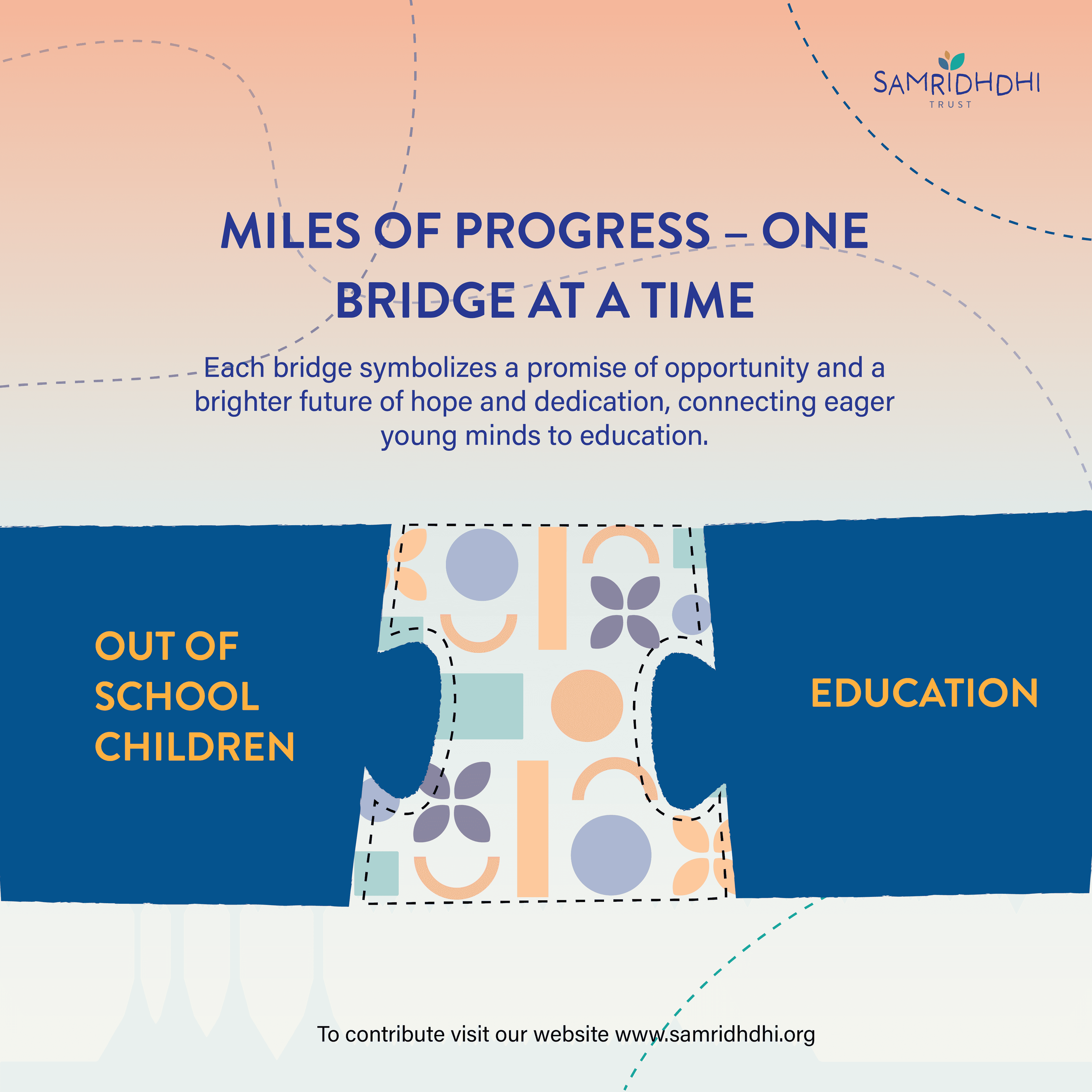
Further applications extended to brochures, badges, space signages, and digital assets like ads, banners, emailers, Instagram posts, and website landing and home pages—collectively building a cohesive and adaptable brand system.
Brand Applications
Following the development of the visual identity, including the logo and supporting graphic elements, the next phase focused on brand applications.
These included a detailed brand guideline booklet outlining usage rules and limitations, along with key collaterals such as visiting cards, letterheads, certificates, ID cards, and tote bags.
Further applications extended to brochures, badges, space signages, and digital assets like ads, banners, emailers, Instagram posts, and website landing and home pages—collectively building a cohesive and adaptable brand system.
Brand Applications
Following the development of the visual identity, including the logo and supporting graphic elements, the next phase focused on brand applications.
These included a detailed brand guideline booklet outlining usage rules and limitations, along with key collaterals such as visiting cards, letterheads, certificates, ID cards, and tote bags.
Further applications extended to brochures, badges, space signages, and digital assets like ads, banners, emailers, Instagram posts, and website landing and home pages—collectively building a cohesive and adaptable brand system.
Brand guideline book
Brand guideline book
Brand guideline book


Visiting cards and Letterhead
Visiting cards and Letterhead
Visiting cards and Letterhead


Certificates and ID cards
Certificates and ID cards
Certificates and ID cards


Tote bag and badges
Tote bag and badges
Tote bag and badges


Brochure
Brochure
Brochure


Signages for the space
Signages for the space
Signages for the space

Digital Ads and Banners
Digital Ads and Banners
Digital Ads and Banners

Emailers
Emailers
Emailers


Instagram posts
Instagram posts
Instagram posts




Website: Homepage
Website: Homepage
Website: Homepage

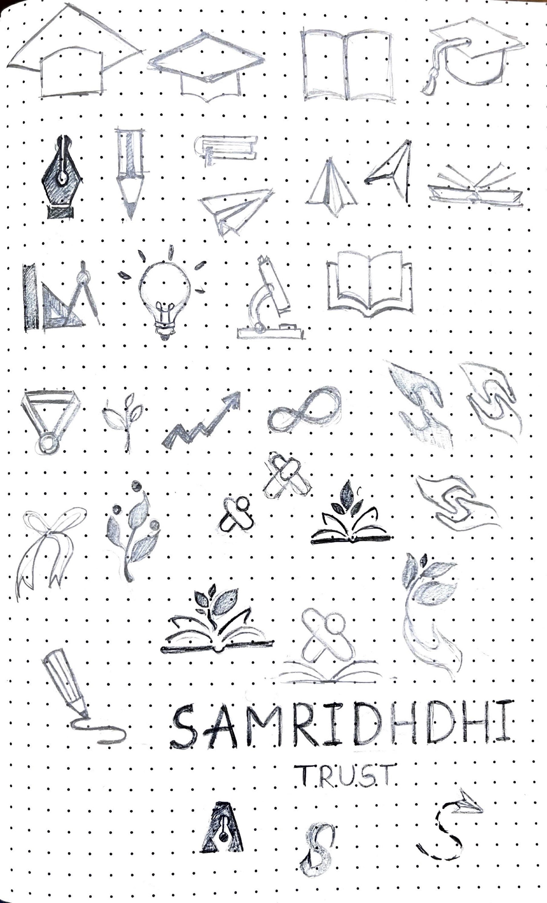
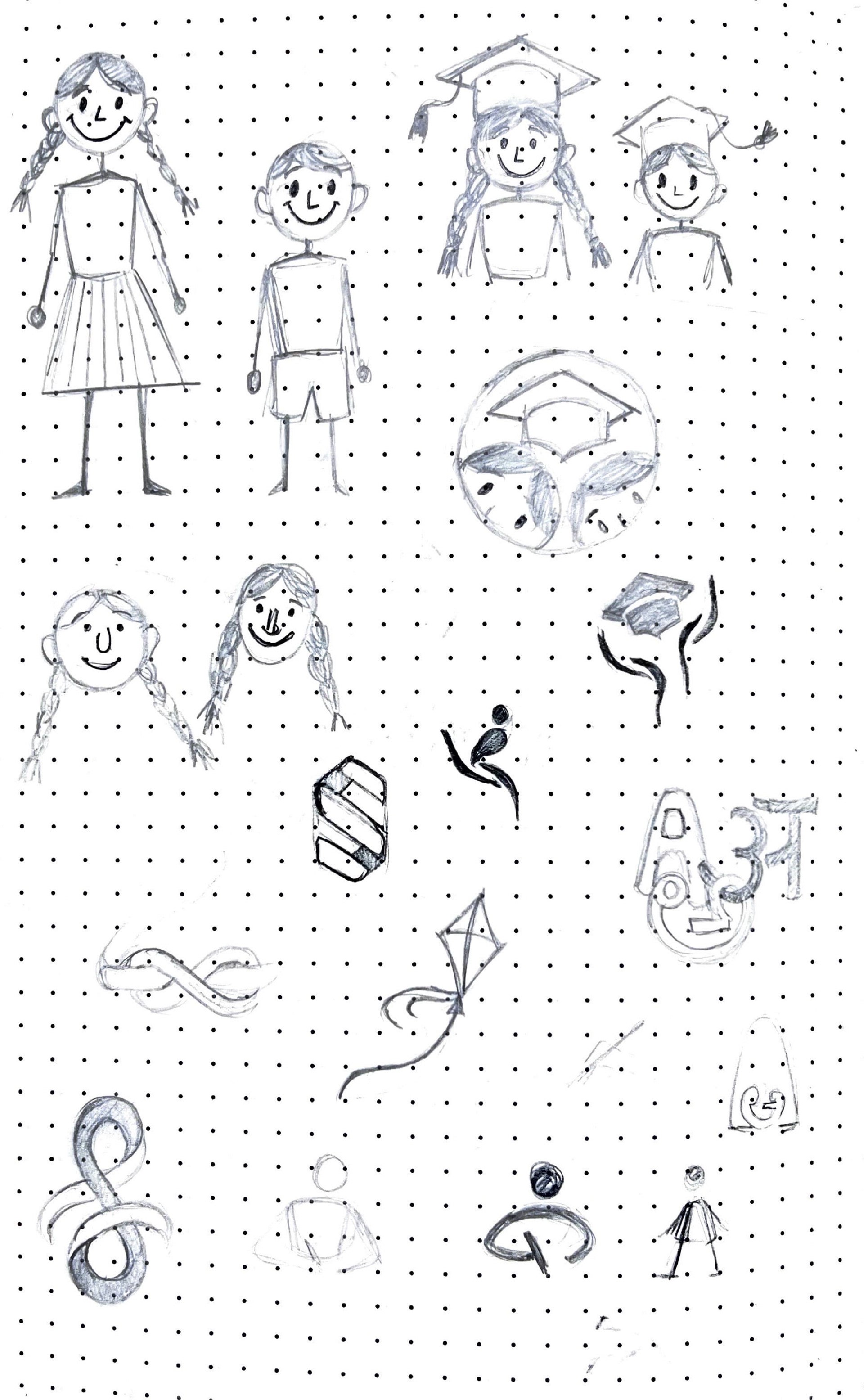
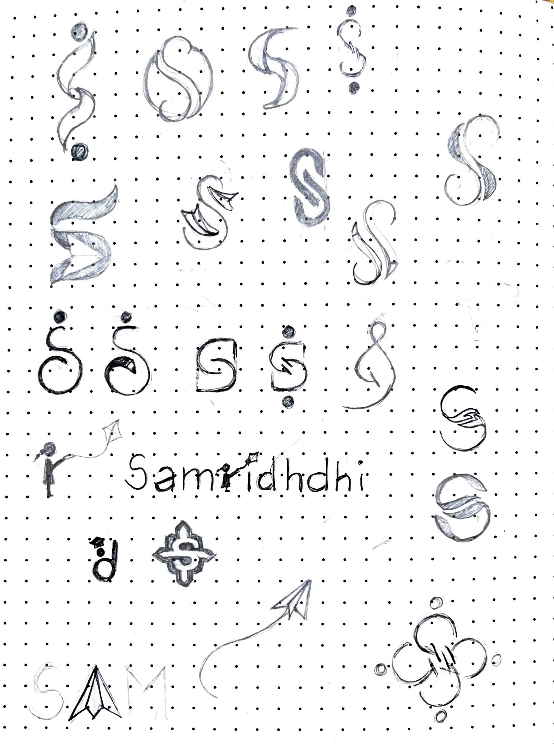
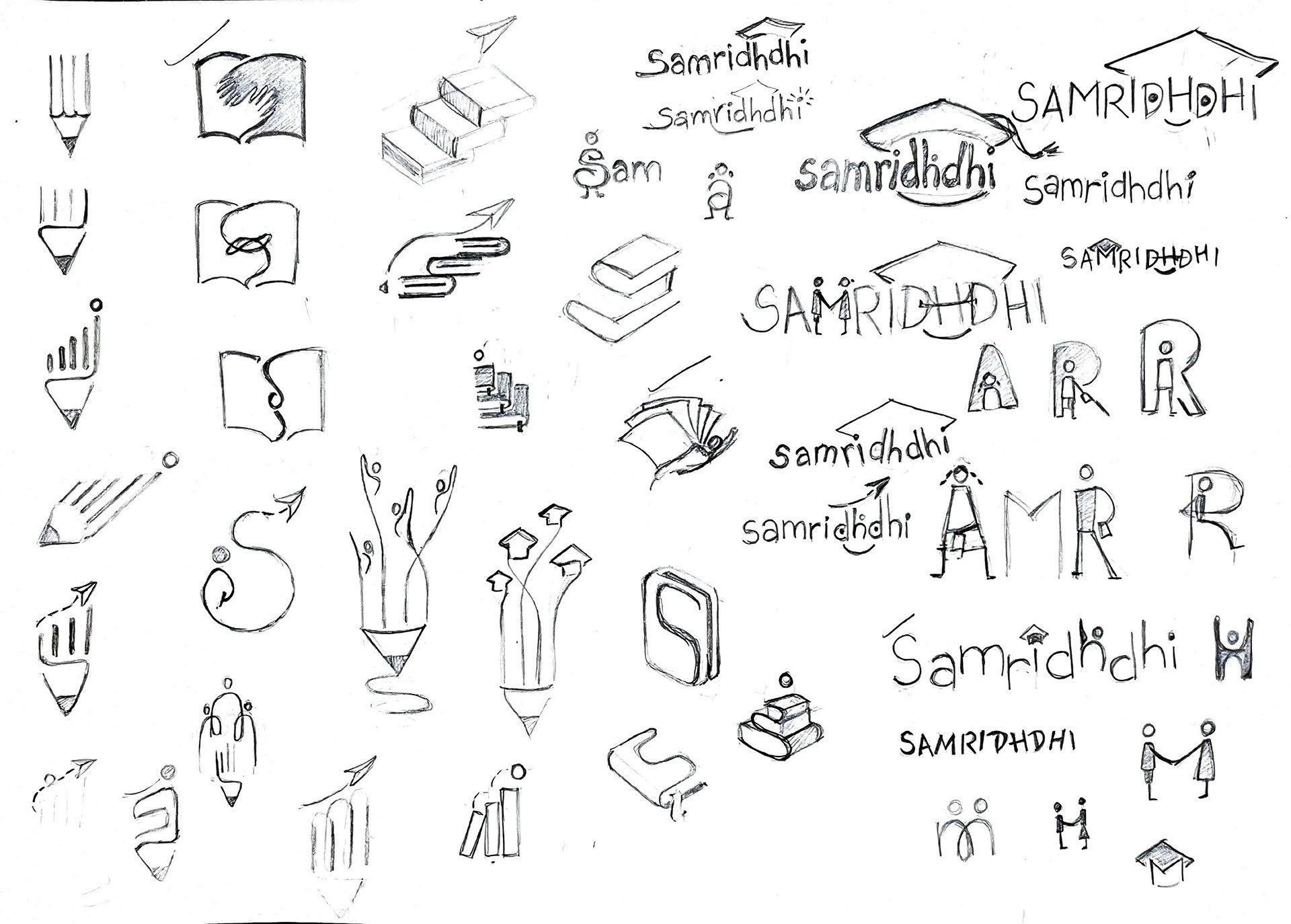
Initial explorations and directions for the brand identity and explorations for brand collaterals
Initial explorations and directions for the brand identity and explorations for brand collaterals
Initial explorations and directions for the brand identity and explorations for brand collaterals




Concluding note
Trying to contribute by creating something for the trust and aiming to support their cause, enhance exposure, and visually represent their principles, is what made this project truly distinct.
Engaging with the children and teachers provided a fresh perspective on the inner workings of the trust. This interaction expanded my understanding of how the trust operated and deepened my connection to their cause.
Additionally, learning about the significant emotional value attached to the working logo for the founders emphasized the profound impact that identity design can wield on both those who embody it and those who encounter it.
Concluding note
Trying to contribute by creating something for the trust and aiming to support their cause, enhance exposure, and visually represent their principles, is what made this project truly distinct.
Engaging with the children and teachers provided a fresh perspective on the inner workings of the trust. This interaction expanded my understanding of how the trust operated and deepened my connection to their cause.
Additionally, learning about the significant emotional value attached to the working logo for the founders emphasized the profound impact that identity design can wield on both those who embody it and those who encounter it.
Concluding note
Trying to contribute by creating something for the trust and aiming to support their cause, enhance exposure, and visually represent their principles, is what made this project truly distinct.
Engaging with the children and teachers provided a fresh perspective on the inner workings of the trust. This interaction expanded my understanding of how the trust operated and deepened my connection to their cause.
Additionally, learning about the significant emotional value attached to the working logo for the founders emphasized the profound impact that identity design can wield on both those who embody it and those who encounter it.
*All photographs utilized in the project were captured by me, with the exception of those used in the digital banners and advertisements and a few in the landing page.
*All photographs utilized in the project were captured by me, with the exception of those used in the digital banners and advertisements and a few in the landing page.
*All photographs utilized in the project were captured by me, with the exception of those used in the digital banners and advertisements and a few in the landing page.
Not everything here's polished yet, but the heart of it is here :)
Thanks for visiting!
Not everything here's polished yet, but the heart of it is here :)
Thanks for visiting!
Not everything here's polished yet, but the heart of it is here :)
Thanks for visiting!