Identity and Web Design
Type: Client project (Kiggle Foundation)
Brand Identity | Visual Language | Website Design |
Building a cohesive identity system for an education collective focused on experiential learning: Kiggle
Designed a complete visual identity system for Kiggle — a foundation supporting diverse education initiatives. The scope included branding from the ground up, creating a unified visual language, key collaterals, and an intuitive website to reflect Kiggle’s brand values.
Role: Lead Designer (Brand Identity, Collaterals, Web Design)
Tools used: Illustrator • Photoshop • Figma
Duration: 4 weeks · 2025
Identity and Web Design
Type: Client project (Kiggle Foundation)
Brand Identity | Visual Language | Website Design |
Building a cohesive identity system for an education collective focused on experiential learning: Kiggle
Designed a complete visual identity system for Kiggle — a foundation supporting diverse education initiatives. The scope included branding from the ground up, creating a unified visual language, key collaterals, and an intuitive website to reflect Kiggle’s brand values.
Role: Lead Designer (Brand Identity, Collaterals, Web Design)
Tools used: Illustrator • Photoshop • Figma
Duration: 4 weeks · 2025
Identity and Web Design
Type: Client project (Kiggle Foundation)
Brand Identity | Visual Language | Website Design |
Building a cohesive identity system for an education collective focused on experiential learning: Kiggle
Designed a complete visual identity system for Kiggle — a foundation supporting diverse education initiatives. The scope included branding from the ground up, creating a unified visual language, key collaterals, and an intuitive website to reflect Kiggle’s brand values.
Role: Lead Designer (Brand Identity, Collaterals, Web Design)
Tools used: Illustrator • Photoshop • Figma
Duration: 4 weeks · 2025

Challenge
Kiggle brings together diverse organizations working in experiential education. The challenge was to create a brand identity that felt cohesive and grounded, while also capturing the unique, unconventional, and playful spirit of the collective. The visual system had to be flexible enough to adapt across partner organizations, while also being distinct, memorable, and easy to use across digital and print platforms.
Challenge
Kiggle brings together diverse organizations working in experiential education. The challenge was to create a brand identity that felt cohesive and grounded, while also capturing the unique, unconventional, and playful spirit of the collective. The visual system had to be flexible enough to adapt across partner organizations, while also being distinct, memorable, and easy to use across digital and print platforms.
Challenge
Kiggle brings together diverse organizations working in experiential education. The challenge was to create a brand identity that felt cohesive and grounded, while also capturing the unique, unconventional, and playful spirit of the collective. The visual system had to be flexible enough to adapt across partner organizations, while also being distinct, memorable, and easy to use across digital and print platforms.


Key things to keep in mind
Understanding Kiggle’s Ecosystem:
Studied the ethos, methods, and tone of organization and its partners to identify shared values.
Tone & Personality Mapping: Conversations revealed that the brand needed to feel warm, joyful, respectful, and collaborative — without being overly corporate.
Inspiration: Drew from nature-inspired forms and tactile, playful elements to reflect Kiggle’s approach to learning.
Key things to keep in mind
Understanding Kiggle’s Ecosystem:
Studied the ethos, methods, and tone of organization and its partners to identify shared values.
Tone & Personality Mapping: Conversations revealed that the brand needed to feel warm, joyful, respectful, and collaborative — without being overly corporate.
Inspiration: Drew from nature-inspired forms and tactile, playful elements to reflect Kiggle’s approach to learning.
Key things to keep in mind
Understanding Kiggle’s Ecosystem:
Studied the ethos, methods, and tone of organization and its partners to identify shared values.
Tone & Personality Mapping: Conversations revealed that the brand needed to feel warm, joyful, respectful, and collaborative — without being overly corporate.
Inspiration: Drew from nature-inspired forms and tactile, playful elements to reflect Kiggle’s approach to learning.
Brand Archetype & Positioning
To define the brand personality, an archetype exercise was done. Two primary archetypes emerged:
The Creator – imaginative, innovative, and driven to bring fresh ideas into the world
The Caregiver – nurturing, supportive, and focused on fostering growth and collaboration
Brand Archetype & Positioning
To define the brand personality, an archetype exercise was done. Two primary archetypes emerged:
The Creator – imaginative, innovative, and driven to bring fresh ideas into the world
The Caregiver – nurturing, supportive, and focused on fostering growth and collaboration
Brand Archetype & Positioning
To define the brand personality, an archetype exercise was done. Two primary archetypes emerged:
The Creator – imaginative, innovative, and driven to bring fresh ideas into the world
The Caregiver – nurturing, supportive, and focused on fostering growth and collaboration


Brand personality, voice and tone
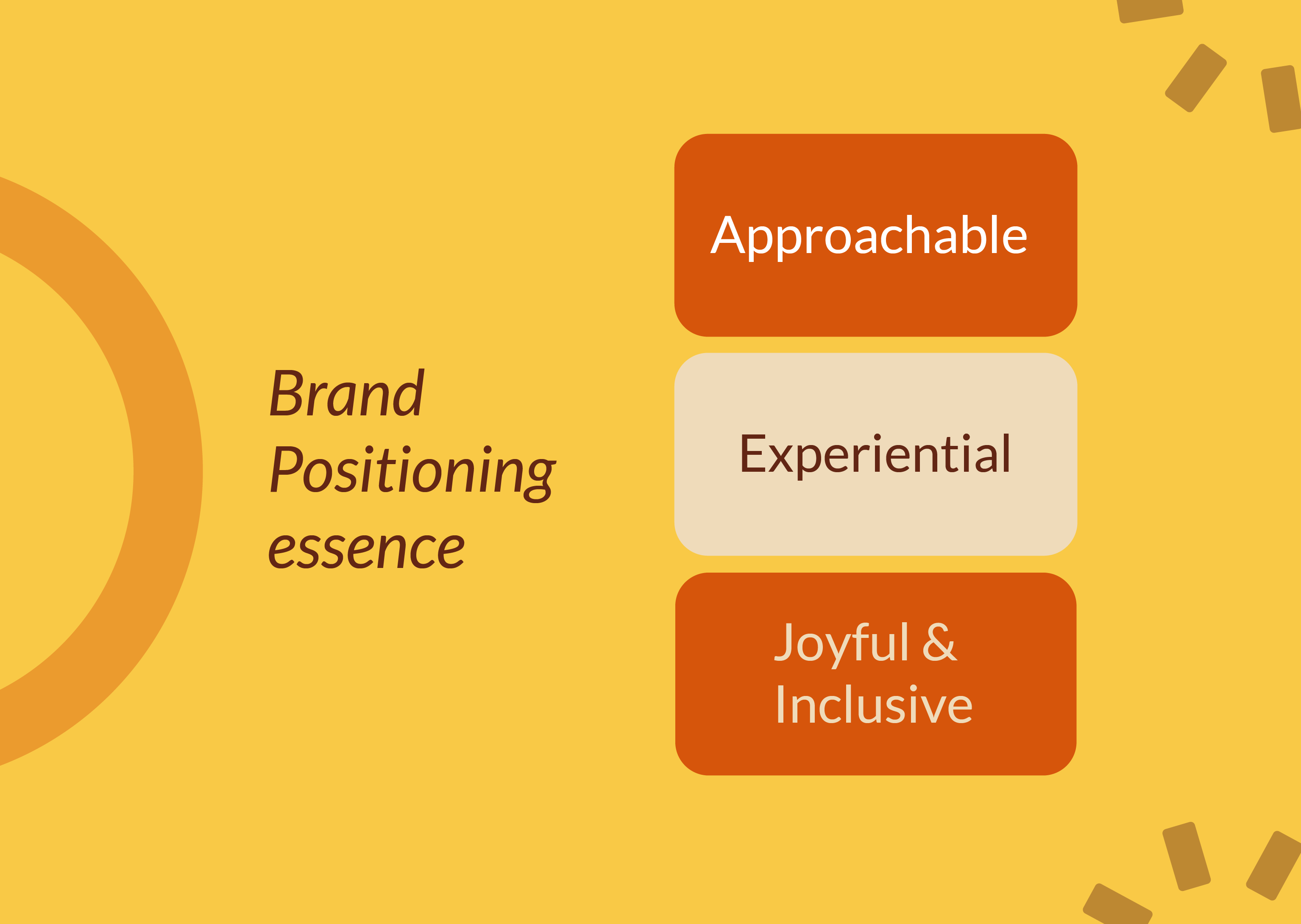
Keywords that captured Kiggle’s essence:
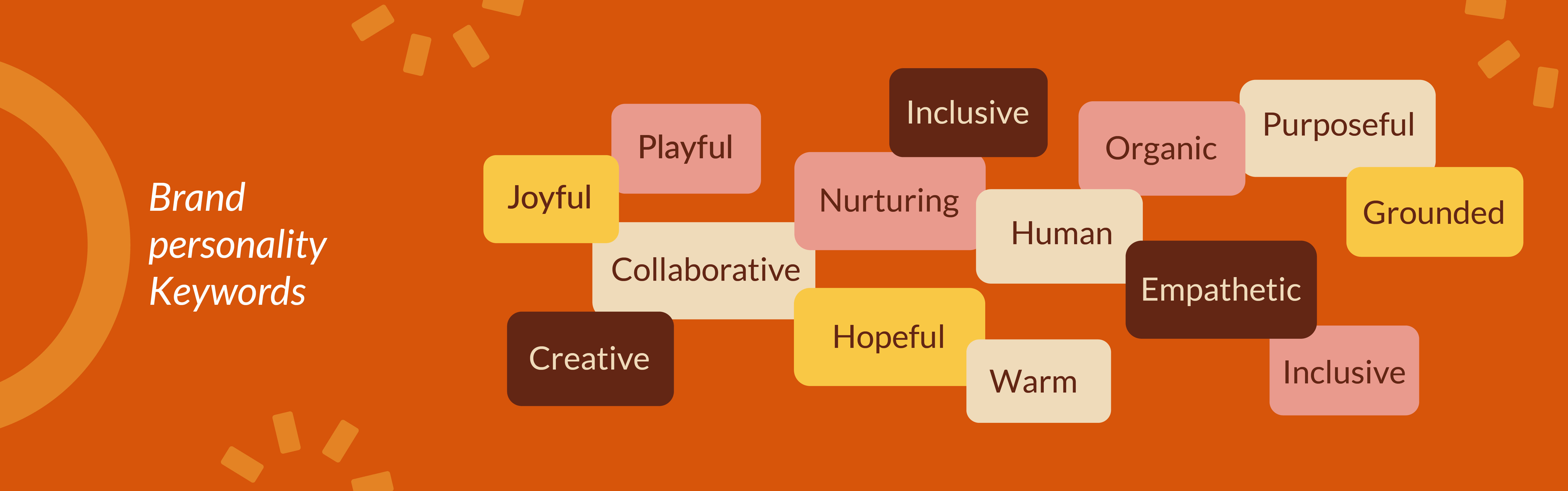
Personality: Joyful, Collaborative, Nurturing, Curious, Organic
Essence: “A collective that grows ideas through shared learning and creativity.”
Tone: Warm, Respectful, Inclusive
Brand personality, voice and tone
Keywords that captured Kiggle’s essence:
Personality: Joyful, Collaborative, Nurturing, Curious, Organic
Essence: “A collective that grows ideas through shared learning and creativity.”
Tone: Warm, Respectful, Inclusive
Brand personality, voice and tone
Keywords that captured Kiggle’s essence:
Personality: Joyful, Collaborative, Nurturing, Curious, Organic
Essence: “A collective that grows ideas through shared learning and creativity.”
Tone: Warm, Respectful, Inclusive
Moodboard and Brand study
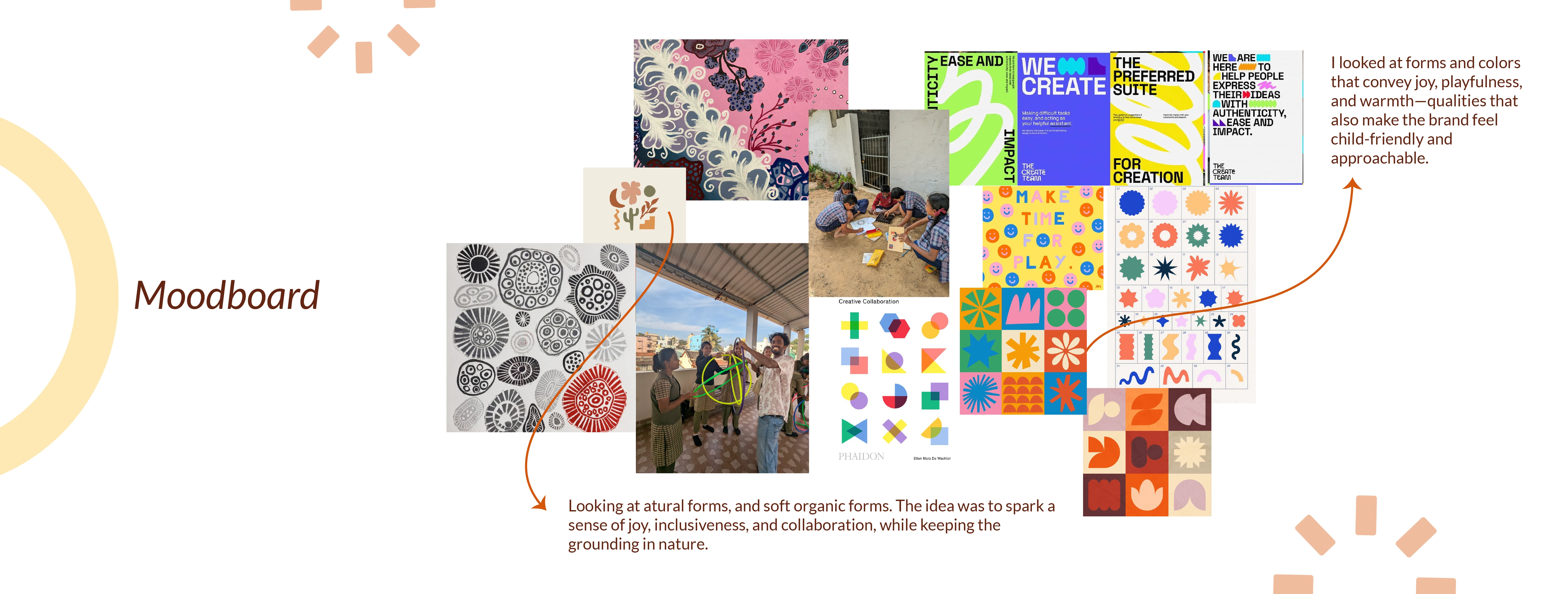
Explored putting together the essence of the brand through color, form, and feeling — focusing on joy, playfulness, and warmth. Incorporated organic, nature-inspired elements to reflect the founder’s vision for experiential, nature-based learning.
Moodboard and Brand study
Explored putting together the essence of the brand through color, form, and feeling — focusing on joy, playfulness, and warmth. Incorporated organic, nature-inspired elements to reflect the founder’s vision for experiential, nature-based learning.
Moodboard and Brand study
Explored putting together the essence of the brand through color, form, and feeling — focusing on joy, playfulness, and warmth. Incorporated organic, nature-inspired elements to reflect the founder’s vision for experiential, nature-based learning.
Visual Explorations for the Brand identity
Early explorations ranged from semi-formal concepts to playful, joy-evoking iterations. Ideas stemmed from the sense of an emerging collective, evolving into explorations around curiosity, building blocks, ecosystems, and nature-inspired forms.
Visual Explorations for the Brand identity
Early explorations ranged from semi-formal concepts to playful, joy-evoking iterations. Ideas stemmed from the sense of an emerging collective, evolving into explorations around curiosity, building blocks, ecosystems, and nature-inspired forms.
Visual Explorations for the Brand identity
Early explorations ranged from semi-formal concepts to playful, joy-evoking iterations. Ideas stemmed from the sense of an emerging collective, evolving into explorations around curiosity, building blocks, ecosystems, and nature-inspired forms.
Different rough conceptual explorations for the logo
Different rough conceptual explorations for the logo
Different rough conceptual explorations for the logo

Final Identity
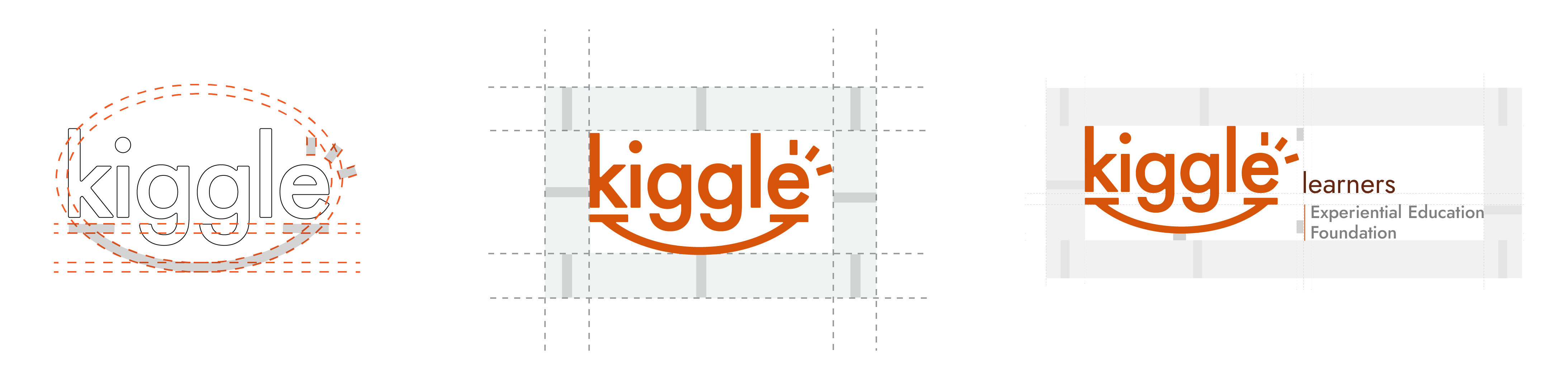
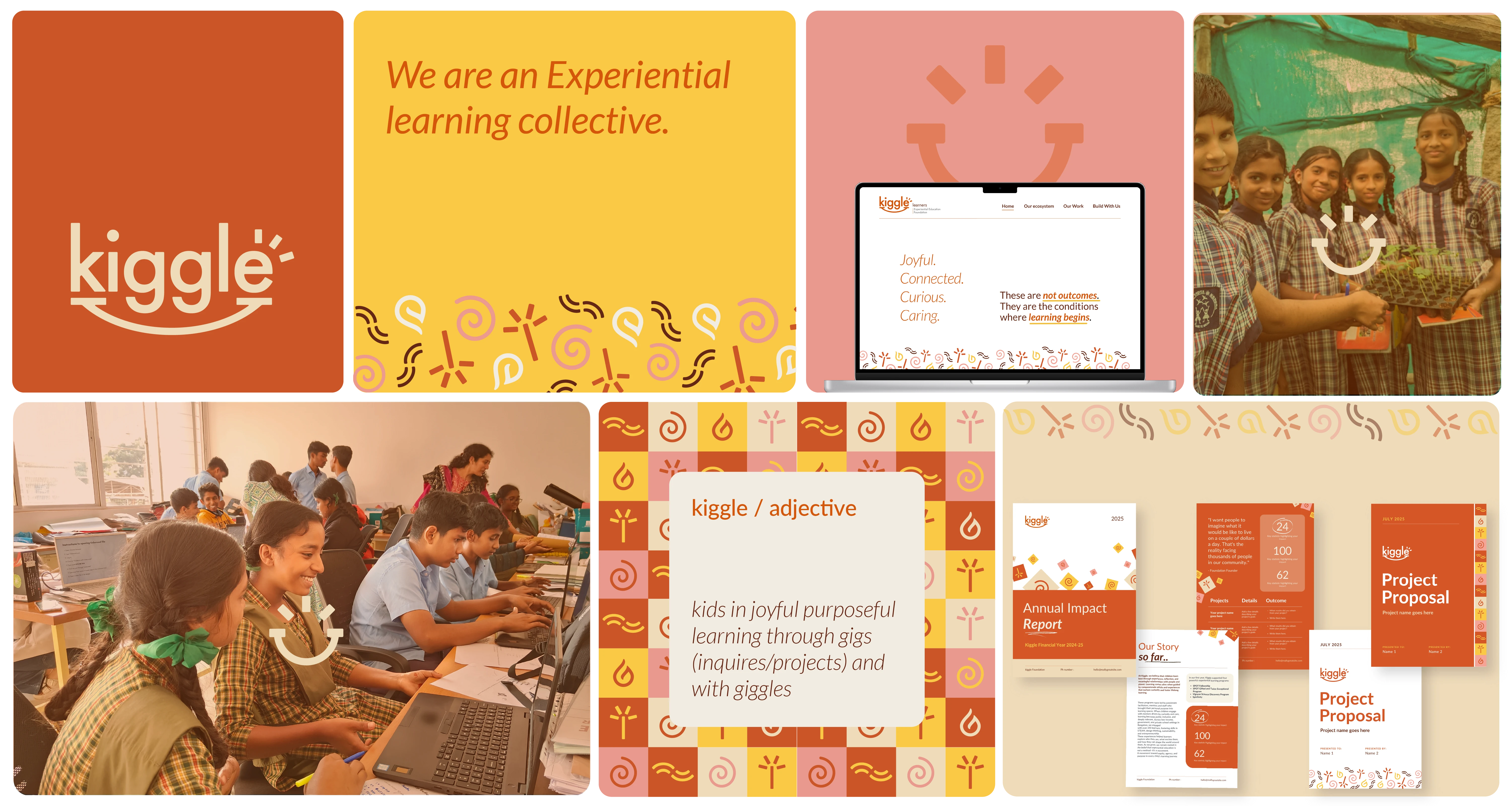
The final logo drew inspiration from the word giggle — symbolizing warmth, joy, and curiosity. The smile-like curve and dynamic ‘burst’ at the end of the “E” express energy and discovery, while the clean font maintains a balanced, professional tone. Multiple logo versions were created to suit different applications — Kiggle Foundation, Kiggle Experiential Education Foundation, and the standalone Kiggle mark.
The final visual identity system drew inspiration from the four natural elements—earth, wind, fire, and water—interpreted in abstract, minimal forms. These became part of the brand’s flexible system, bringing in vibrancy without leaning on literal icons.
Final Identity
The final logo drew inspiration from the word giggle — symbolizing warmth, joy, and curiosity. The smile-like curve and dynamic ‘burst’ at the end of the “E” express energy and discovery, while the clean font maintains a balanced, professional tone. Multiple logo versions were created to suit different applications — Kiggle Foundation, Kiggle Experiential Education Foundation, and the standalone Kiggle mark.
The final visual identity system drew inspiration from the four natural elements—earth, wind, fire, and water—interpreted in abstract, minimal forms. These became part of the brand’s flexible system, bringing in vibrancy without leaning on literal icons.
Final Identity
The final logo drew inspiration from the word giggle — symbolizing warmth, joy, and curiosity. The smile-like curve and dynamic ‘burst’ at the end of the “E” express energy and discovery, while the clean font maintains a balanced, professional tone. Multiple logo versions were created to suit different applications — Kiggle Foundation, Kiggle Experiential Education Foundation, and the standalone Kiggle mark.
The final visual identity system drew inspiration from the four natural elements—earth, wind, fire, and water—interpreted in abstract, minimal forms. These became part of the brand’s flexible system, bringing in vibrancy without leaning on literal icons.
Developing brand applications
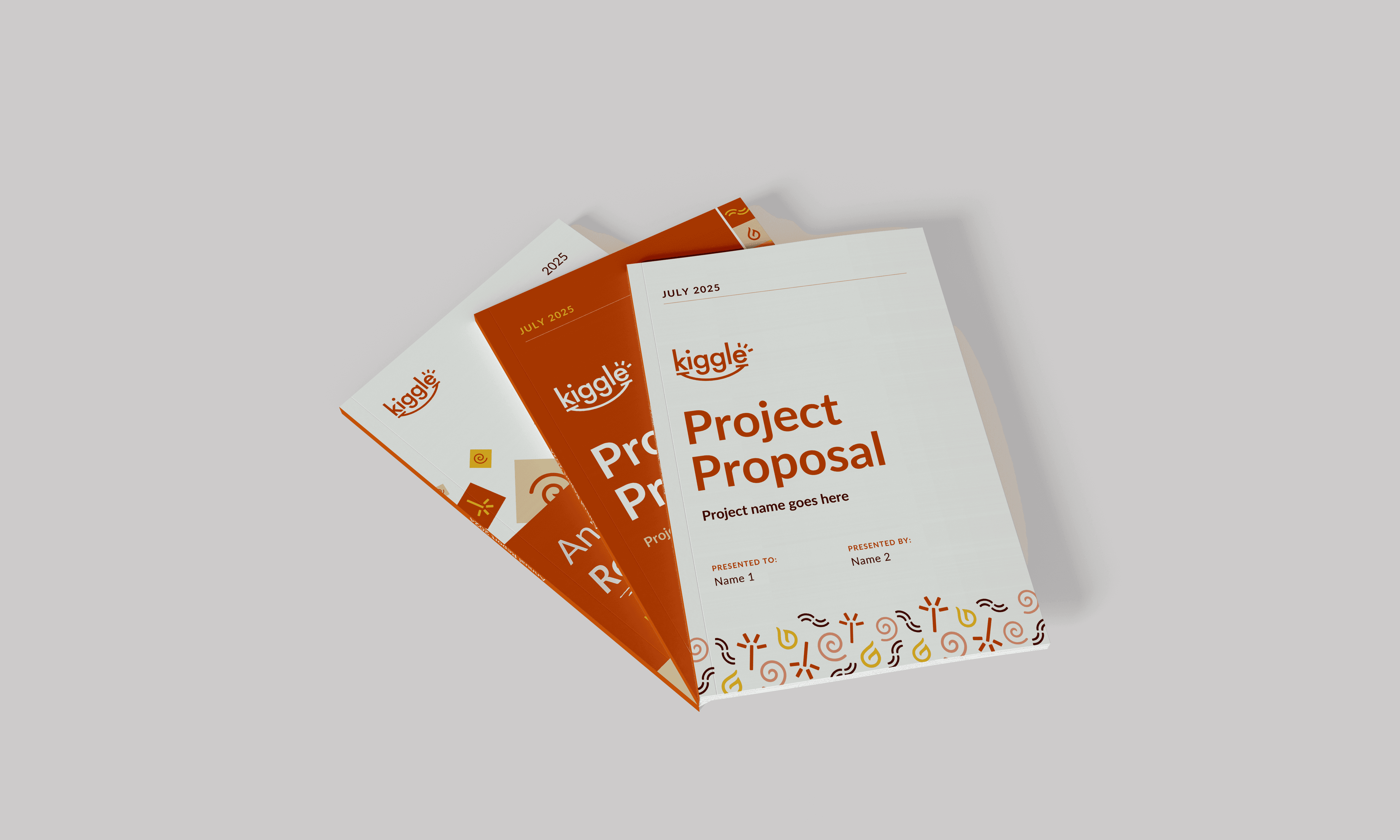
Once the visual identity was established, the next step was to extend it into practical brand applications. The goal was to create a cohesive set of templates and collaterals that the team could easily use, adapt, and build upon for future needs.
This included designing essential tools such as business cards, presentation and pitch deck templates, project proposal and lesson plan formats, ID cards, and other digital and communication assets. A few of these have been showcased here to illustrate how the identity translated into everyday touchpoints for the organization.
Developing brand applications
Once the visual identity was established, the next step was to extend it into practical brand applications. The goal was to create a cohesive set of templates and collaterals that the team could easily use, adapt, and build upon for future needs.
This included designing essential tools such as business cards, presentation and pitch deck templates, project proposal and lesson plan formats, ID cards, and other digital and communication assets. A few of these have been showcased here to illustrate how the identity translated into everyday touchpoints for the organization.
Developing brand applications
Once the visual identity was established, the next step was to extend it into practical brand applications. The goal was to create a cohesive set of templates and collaterals that the team could easily use, adapt, and build upon for future needs.
This included designing essential tools such as business cards, presentation and pitch deck templates, project proposal and lesson plan formats, ID cards, and other digital and communication assets. A few of these have been showcased here to illustrate how the identity translated into everyday touchpoints for the organization.
The brand guideline book
The brand guideline book
The brand guideline book


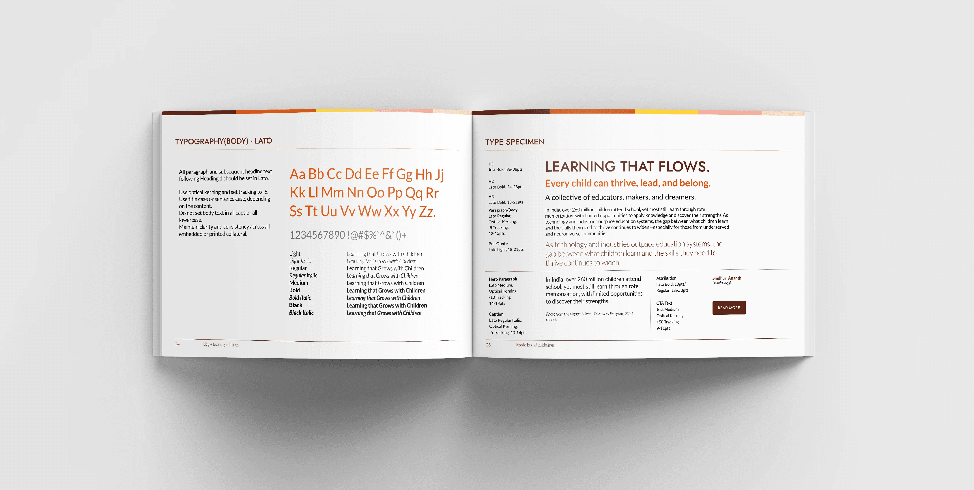
Business card Designs
Business card Designs
Business card Designs


Digitally designed project proposal and annual report templates for easy and flexible team use.
Digitally designed project proposal and annual report templates for easy and flexible team use.
Digitally designed project proposal and annual report templates for easy and flexible team use.


Presentation / pitch deck template created in line with the brand system, with placeholder text and images for easy team use
Presentation / pitch deck template created in line with the brand system, with placeholder text and images for easy team use
Presentation / pitch deck template created in line with the brand system, with placeholder text and images for easy team use

Website design
The website was envisioned as a simple, clear space to communicate who the collective is, what they do, and how people can connect with them. Since the organization is still in its early stages, the intention was to keep the website minimal and functional rather than elaborate.
The focus was on introducing the collective, highlighting the partner organizations that form its core, and providing straightforward call-to-actions for potential collaborators.
The information architecture went through multiple rounds of iteration — starting from a more extensive structure and gradually narrowing down to what was essential for the current phase. The final layout defined the key pages, their hierarchy, and the content blocks within each section.
This process also explored how the visual identity could extend into the digital format, ensuring a consistent and adaptable system that can evolve as the organization and its website grow over time.
Website design
The website was envisioned as a simple, clear space to communicate who the collective is, what they do, and how people can connect with them. Since the organization is still in its early stages, the intention was to keep the website minimal and functional rather than elaborate.
The focus was on introducing the collective, highlighting the partner organizations that form its core, and providing straightforward call-to-actions for potential collaborators.
The information architecture went through multiple rounds of iteration — starting from a more extensive structure and gradually narrowing down to what was essential for the current phase. The final layout defined the key pages, their hierarchy, and the content blocks within each section.
This process also explored how the visual identity could extend into the digital format, ensuring a consistent and adaptable system that can evolve as the organization and its website grow over time.
Website design
The website was envisioned as a simple, clear space to communicate who the collective is, what they do, and how people can connect with them. Since the organization is still in its early stages, the intention was to keep the website minimal and functional rather than elaborate.
The focus was on introducing the collective, highlighting the partner organizations that form its core, and providing straightforward call-to-actions for potential collaborators.
The information architecture went through multiple rounds of iteration — starting from a more extensive structure and gradually narrowing down to what was essential for the current phase. The final layout defined the key pages, their hierarchy, and the content blocks within each section.
This process also explored how the visual identity could extend into the digital format, ensuring a consistent and adaptable system that can evolve as the organization and its website grow over time.
Exploring multiple iterations of the sitemap to simplify structure and define content blocks for each page.
Exploring multiple iterations of the sitemap to simplify structure and define content blocks for each page.
Exploring multiple iterations of the sitemap to simplify structure and define content blocks for each page.


Latest website prototype showcasing basic pages, content blocks, and placeholders; establishing the core layout and structure
Latest website prototype showcasing basic pages, content blocks, and placeholders; establishing the core layout and structure
Latest website prototype showcasing basic pages, content blocks, and placeholders; establishing the core layout and structure

Ideation for a sub-brand: Earthyhands
Context: Earthy Hands was envisioned as a nature-based project space under Kiggle, focused on experiential learning for children. The initiative aimed to create programs where kids could learn through interacting with nature — experiencing, growing, creating, and even developing entrepreneurial skills from their projects.
Approach: Although the initiative was still at a nascent stage, initial visual explorations were developed to reflect its essence—grounded, organic, and child-friendly. A mood board was created to explore visual directions inspired by nature and the brand name, followed by multiple logo and visual identity iterations. These served as a base for possible future directions if the initiative expands.
Ideation for a sub-brand: Earthyhands
Context: Earthy Hands was envisioned as a nature-based project space under Kiggle, focused on experiential learning for children. The initiative aimed to create programs where kids could learn through interacting with nature — experiencing, growing, creating, and even developing entrepreneurial skills from their projects.
Approach: Although the initiative was still at a nascent stage, initial visual explorations were developed to reflect its essence—grounded, organic, and child-friendly. A mood board was created to explore visual directions inspired by nature and the brand name, followed by multiple logo and visual identity iterations. These served as a base for possible future directions if the initiative expands.
Ideation for a sub-brand: Earthyhands
Context: Earthy Hands was envisioned as a nature-based project space under Kiggle, focused on experiential learning for children. The initiative aimed to create programs where kids could learn through interacting with nature — experiencing, growing, creating, and even developing entrepreneurial skills from their projects.
Approach: Although the initiative was still at a nascent stage, initial visual explorations were developed to reflect its essence—grounded, organic, and child-friendly. A mood board was created to explore visual directions inspired by nature and the brand name, followed by multiple logo and visual identity iterations. These served as a base for possible future directions if the initiative expands.
A nature-inspired mood board capturing the essence and guiding the visual direction of the sub brand earthyhands
A nature-inspired mood board capturing the essence and guiding the visual direction of the sub brand earthyhands
A nature-inspired mood board capturing the essence and guiding the visual direction of the sub brand earthyhands

Rough logo explorations experimenting with forms, concepts, and visual directions for the sub-brand Earthyhands
Rough logo explorations experimenting with forms, concepts, and visual directions for the sub-brand Earthyhands
Rough logo explorations experimenting with forms, concepts, and visual directions for the sub-brand Earthyhands
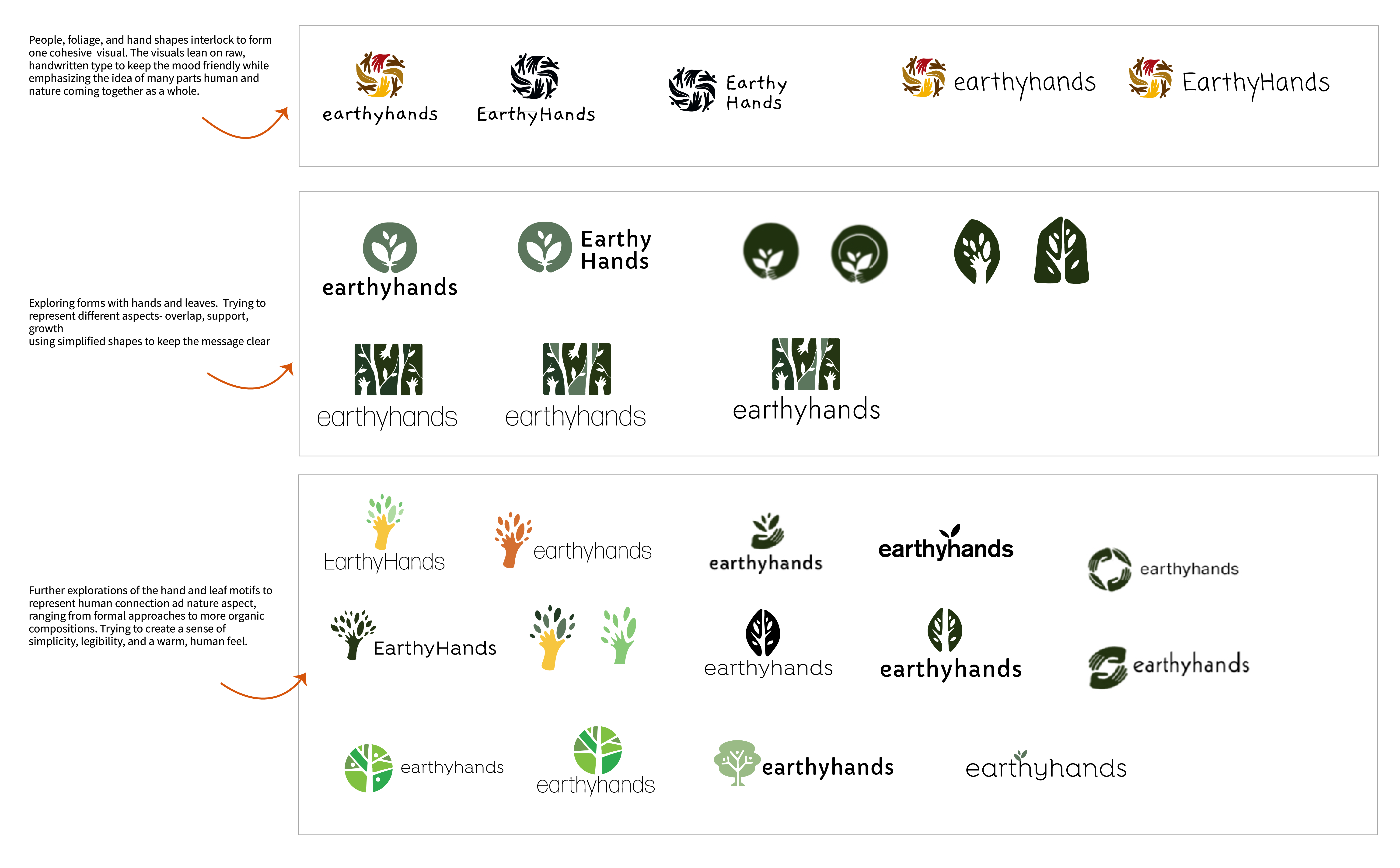
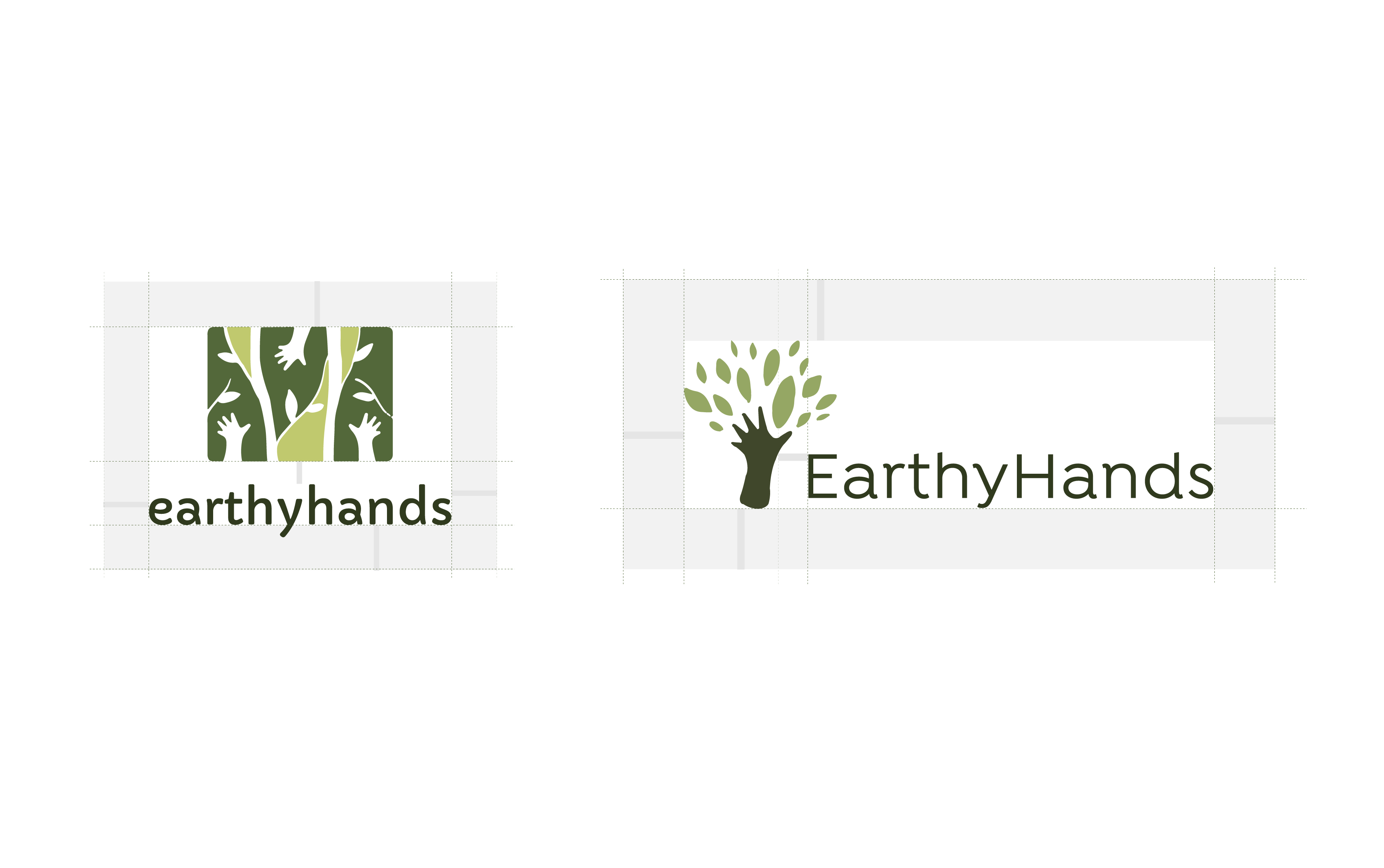
Finally, a basic brand sheet was prepared, featuring the two most favored iterations along with suggested type systems and visual elements. This served as a flexible base that could be extended as the initiative grows.
Finally, a basic brand sheet was prepared, featuring the two most favored iterations along with suggested type systems and visual elements. This served as a flexible base that could be extended as the initiative grows.
Finally, a basic brand sheet was prepared, featuring the two most favored iterations along with suggested type systems and visual elements. This served as a flexible base that could be extended as the initiative grows.
Favored logo iterations along with a brand sheet, presenting type, color, and visual guidelines
Favored logo iterations along with a brand sheet, presenting type, color, and visual guidelines
Favored logo iterations along with a brand sheet, presenting type, color, and visual guidelines

Key Learnings & Future Improvements
Biophilic and biomorphic design: This project reinforced the value of consciously incorporating nature-inspired design elements. While these aspects can emerge organically, deliberately integrating them can evoke specific feelings, and enrich the overall experience.
Even if a specific concept doesn’t fit the logo, elements reflecting the founder’s preferences, like nature-inspired motifs, could still be incorporated across other brand assets, creating a cohesive system.
Given the scale and logistics of the project, it was important to balance exploration with simplicity, ensuring the designs were aligned with the organization’s early stage while maintaining creative freedom.
Extended typographic exploration: The sub-brand Earthy Hands could benefit from further type studies to refine its visual identity and make it more expressive.
Website development: The current website functions as a base template. Future iterations could expand the site with richer content, more dynamic layouts, and interactive elements.
Diversifying iterations: Spending more time on diverse concept explorations, including different types, forms, and visual elements, could lead to more nuanced solutions.
Regional language variants: Adapting the brand identity for regional languages could enhance accessibility and reach for diverse audiences.
Key Learnings & Future Improvements
Biophilic and biomorphic design: This project reinforced the value of consciously incorporating nature-inspired design elements. While these aspects can emerge organically, deliberately integrating them can evoke specific feelings, and enrich the overall experience.
Even if a specific concept doesn’t fit the logo, elements reflecting the founder’s preferences, like nature-inspired motifs, could still be incorporated across other brand assets, creating a cohesive system.
Given the scale and logistics of the project, it was important to balance exploration with simplicity, ensuring the designs were aligned with the organization’s early stage while maintaining creative freedom.
Extended typographic exploration: The sub-brand Earthy Hands could benefit from further type studies to refine its visual identity and make it more expressive.
Website development: The current website functions as a base template. Future iterations could expand the site with richer content, more dynamic layouts, and interactive elements.
Diversifying iterations: Spending more time on diverse concept explorations, including different types, forms, and visual elements, could lead to more nuanced solutions.
Regional language variants: Adapting the brand identity for regional languages could enhance accessibility and reach for diverse audiences.
Key Learnings & Future Improvements
Biophilic and biomorphic design: This project reinforced the value of consciously incorporating nature-inspired design elements. While these aspects can emerge organically, deliberately integrating them can evoke specific feelings, and enrich the overall experience.
Even if a specific concept doesn’t fit the logo, elements reflecting the founder’s preferences, like nature-inspired motifs, could still be incorporated across other brand assets, creating a cohesive system.
Given the scale and logistics of the project, it was important to balance exploration with simplicity, ensuring the designs were aligned with the organization’s early stage while maintaining creative freedom.
Extended typographic exploration: The sub-brand Earthy Hands could benefit from further type studies to refine its visual identity and make it more expressive.
Website development: The current website functions as a base template. Future iterations could expand the site with richer content, more dynamic layouts, and interactive elements.
Diversifying iterations: Spending more time on diverse concept explorations, including different types, forms, and visual elements, could lead to more nuanced solutions.
Regional language variants: Adapting the brand identity for regional languages could enhance accessibility and reach for diverse audiences.
Not everything here's polished yet, but the heart of it is here :)
Thanks for visiting!
Not everything here's polished yet, but the heart of it is here :)
Thanks for visiting!