Healthcare Experience Design
Type: Client project (Selco foundation X Doto health)
Communication Design | Wayfinding | Print Design | Information Design | Experience Design
Designing communication and Experience Blueprint for PHCs to improve experience and awareness
A collaborative effort with Selco Foundation and Doto Health as clients to curate a blueprint experience for PHCs, enabling their transition into model healthcare centers through communication design, spatial interventions, and patient-focused touchpoints.
Role: Visual design for posters, maps, and wayfinding, along with development of supporting collaterals, as part of a three-member design team.
Tools used : Illustrator · Photoshop
Duration: 3 weeks · 2025
Healthcare Experience Design
Type: Client project (Selco foundation X Doto health)
Communication Design | Wayfinding | Print Design | Information Design | Experience Design
Designing communication and Experience Blueprint for PHCs to improve experience and awareness
A collaborative effort with Selco Foundation and Doto Health as clients to curate a blueprint experience for PHCs, enabling their transition into model healthcare centers through communication design, spatial interventions, and patient-focused touchpoints.
Role: Visual design for posters, maps, and wayfinding, along with development of supporting collaterals, as part of a three-member design team.
Tools used : Illustrator · Photoshop
Duration: 3 weeks · 2025
Healthcare Experience Design
Type: Client project (Selco foundation X Doto health)
Communication Design | Wayfinding | Print Design | Information Design | Experience Design
Designing communication and Experience Blueprint for PHCs to improve experience and awareness
A collaborative effort with Selco Foundation and Doto Health as clients to curate a blueprint experience for PHCs, enabling their transition into model healthcare centers through communication design, spatial interventions, and patient-focused touchpoints.
Role: Visual design for posters, maps, and wayfinding, along with development of supporting collaterals, as part of a three-member design team.
Tools used : Illustrator · Photoshop
Duration: 3 weeks · 2025

Project Context
This project was a collaboration between Selco Foundation (sustainability), Doto Health (med-tech), and our studio- Social Innovation Studio(design).
The larger vision was to transform Public Health Centers (PHCs) into Model Health Care Centers by curating a replicable experience blueprint that could be scaled across multiple centers.
Our role was to design the experience layer - creating visual and spatial tools that would improve navigation, communication, and usability within PHCs.
Project Context
This project was a collaboration between Selco Foundation (sustainability), Doto Health (med-tech), and our studio- Social Innovation Studio(design).
The larger vision was to transform Public Health Centers (PHCs) into Model Health Care Centers by curating a replicable experience blueprint that could be scaled across multiple centers.
Our role was to design the experience layer - creating visual and spatial tools that would improve navigation, communication, and usability within PHCs.
Project Context
This project was a collaboration between Selco Foundation (sustainability), Doto Health (med-tech), and our studio- Social Innovation Studio(design).
The larger vision was to transform Public Health Centers (PHCs) into Model Health Care Centers by curating a replicable experience blueprint that could be scaled across multiple centers.
Our role was to design the experience layer - creating visual and spatial tools that would improve navigation, communication, and usability within PHCs.
Challenge
To translate identified problem areas into practical, context-specific design solutions that enhance the day-to-day experience of patients and staff.
The challenges were:
Create clear and intuitive communication and navigation for diverse audiences
Ensure materials are easily replicable across multiple PHCs
Strengthen the overall patient and staff experience through small but high-impact interventions
Ensure all collaterals adhere to the existing visual system established by previous designers, maintaining cohesive and consistent design across the project
Challenge
To translate identified problem areas into practical, context-specific design solutions that enhance the day-to-day experience of patients and staff.
The challenges were:
Create clear and intuitive communication and navigation for diverse audiences
Ensure materials are easily replicable across multiple PHCs
Strengthen the overall patient and staff experience through small but high-impact interventions
Ensure all collaterals adhere to the existing visual system established by previous designers, maintaining cohesive and consistent design across the project
Challenge
To translate identified problem areas into practical, context-specific design solutions that enhance the day-to-day experience of patients and staff.
The challenges were:
Create clear and intuitive communication and navigation for diverse audiences
Ensure materials are easily replicable across multiple PHCs
Strengthen the overall patient and staff experience through small but high-impact interventions
Ensure all collaterals adhere to the existing visual system established by previous designers, maintaining cohesive and consistent design across the project
Research & Immersion
The studio's research and design team had already conducted field visits to PHCs
They mapped patient and staff journeys, identifying touchpoints, pain points, and opportunities for experience enhancement
I was not directly part of this phase but worked with the insights and directions generated here while ideating for collaterals in the next phase
Research & Immersion
The studio's research and design team had already conducted field visits to PHCs
They mapped patient and staff journeys, identifying touchpoints, pain points, and opportunities for experience enhancement
I was not directly part of this phase but worked with the insights and directions generated here while ideating for collaterals in the next phase
Research & Immersion
The studio's research and design team had already conducted field visits to PHCs
They mapped patient and staff journeys, identifying touchpoints, pain points, and opportunities for experience enhancement
I was not directly part of this phase but worked with the insights and directions generated here while ideating for collaterals in the next phase
Design & Iteration
In the first phase of the project, the team had already developed several collaterals, including, IEC rack (A wall-mounted rack to organize existing materials in the hospital, such as educational resources), Signages, Ceiling stickers (For labor rooms encouraging breathing exercises) etc.
Following the testing, these elements required improvements and additional collaterals were to be created:
Door Stickers & Priority Seating Markers: Created to clearly indicate patient priorities
Main Signage Board/Lightboard: Revisited and updated for clarity
Navigational Aids: Floor stickers introduced to guide visitors to specific rooms
Labor Room Handout: Redesigned as a compact, foldable handout for the mother and accompanying family members
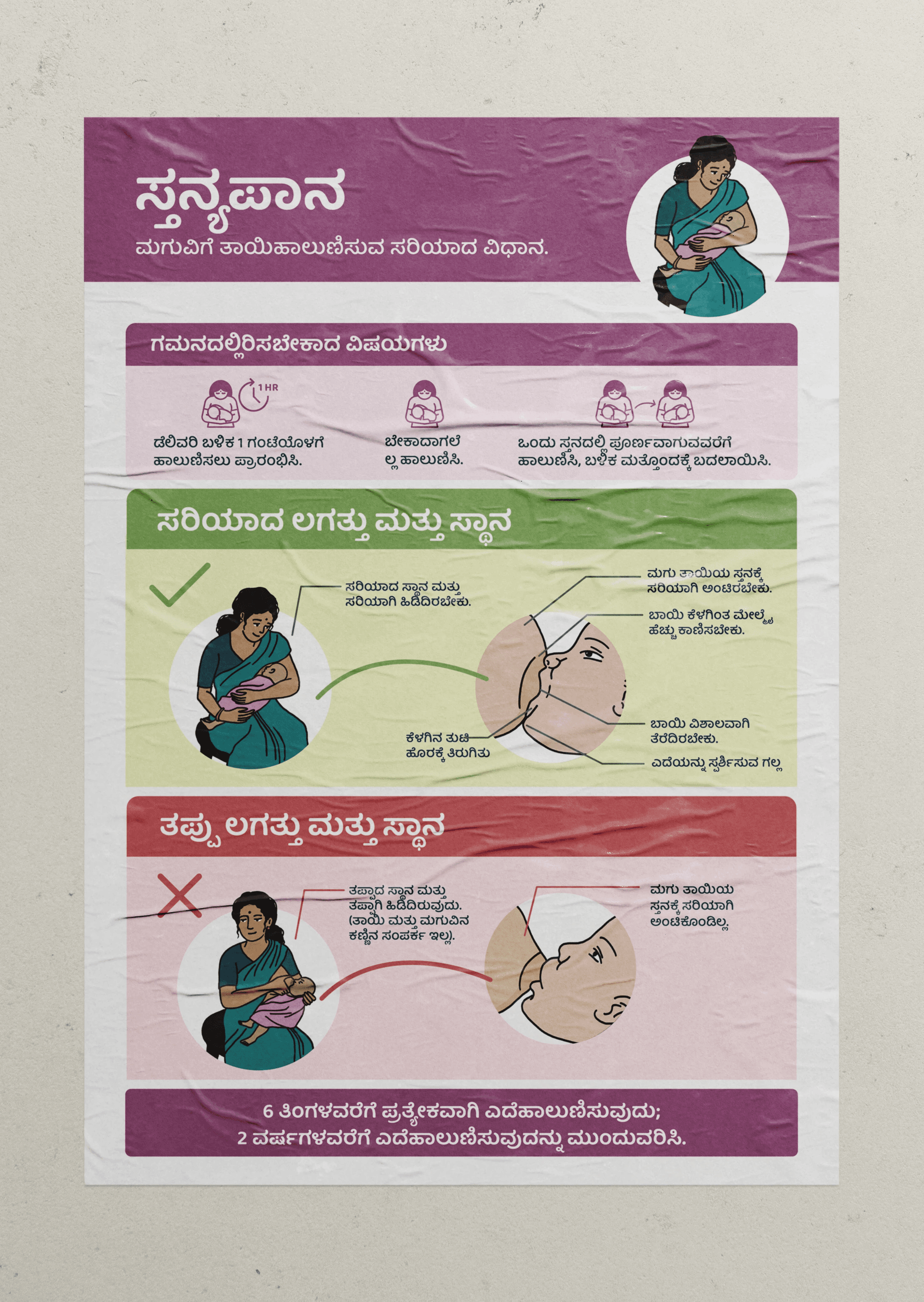
Family Planning & Breastfeeding Collaterals: Posters and a teaching kit created to help doctors explain key topics efficiently
The design system, including typefaces, icons, and colors, was already established. My role focused on creating, iterating, and refining these collaterals within the existing visual framework. All explorations are documented in this section.
Design & Iteration
In the first phase of the project, the team had already developed several collaterals, including, IEC rack (A wall-mounted rack to organize existing materials in the hospital, such as educational resources), Signages, Ceiling stickers (For labor rooms encouraging breathing exercises) etc.
Following the testing, these elements required improvements and additional collaterals were to be created:
Door Stickers & Priority Seating Markers: Created to clearly indicate patient priorities
Main Signage Board/Lightboard: Revisited and updated for clarity
Navigational Aids: Floor stickers introduced to guide visitors to specific rooms
Labor Room Handout: Redesigned as a compact, foldable handout for the mother and accompanying family members
Family Planning & Breastfeeding Collaterals: Posters and a teaching kit created to help doctors explain key topics efficiently
The design system, including typefaces, icons, and colors, was already established. My role focused on creating, iterating, and refining these collaterals within the existing visual framework. All explorations are documented in this section.
Design & Iteration
In the first phase of the project, the team had already developed several collaterals, including, IEC rack (A wall-mounted rack to organize existing materials in the hospital, such as educational resources), Signages, Ceiling stickers (For labor rooms encouraging breathing exercises) etc.
Following the testing, these elements required improvements and additional collaterals were to be created:
Door Stickers & Priority Seating Markers: Created to clearly indicate patient priorities
Main Signage Board/Lightboard: Revisited and updated for clarity
Navigational Aids: Floor stickers introduced to guide visitors to specific rooms
Labor Room Handout: Redesigned as a compact, foldable handout for the mother and accompanying family members
Family Planning & Breastfeeding Collaterals: Posters and a teaching kit created to help doctors explain key topics efficiently
The design system, including typefaces, icons, and colors, was already established. My role focused on creating, iterating, and refining these collaterals within the existing visual framework. All explorations are documented in this section.
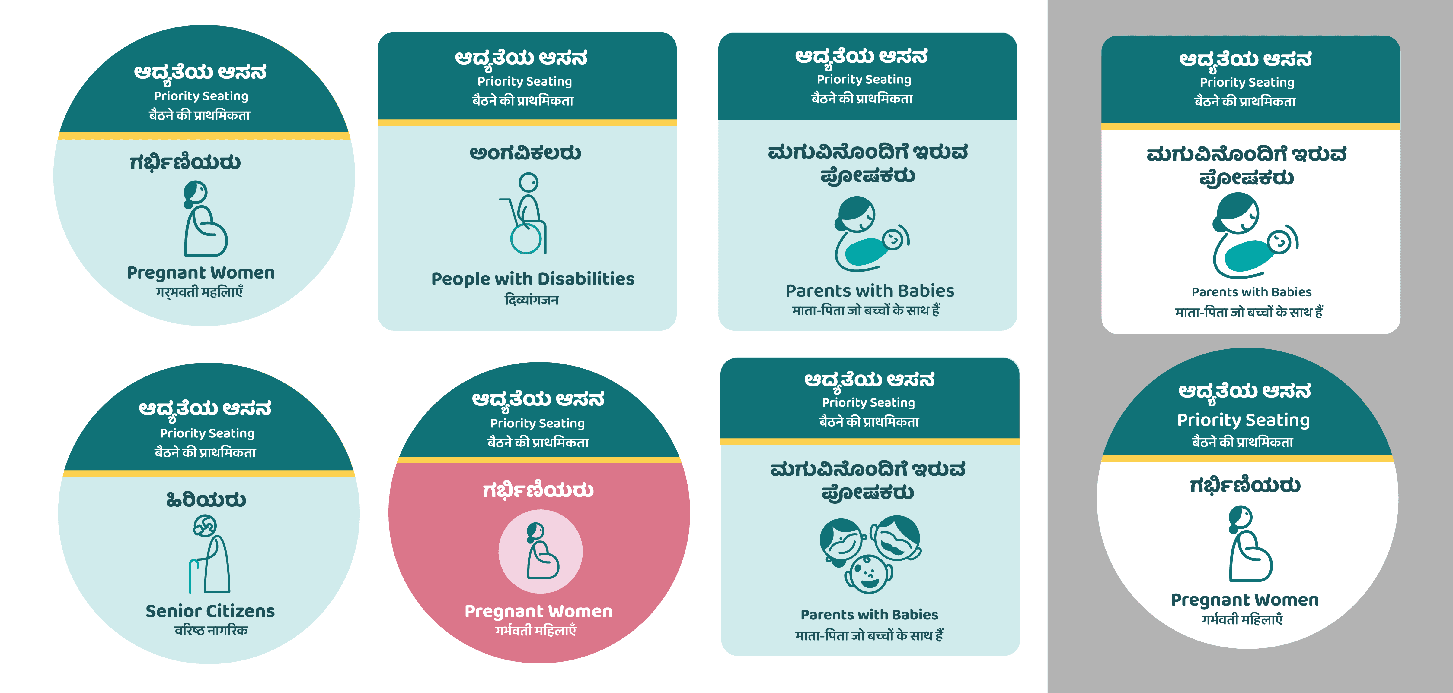
Iterations and explorations for door stickers
Iterations and explorations for door stickers
Iterations and explorations for door stickers

Iterations and explorations for navigational floor stickers
Iterations and explorations for navigational floor stickers
Iterations and explorations for navigational floor stickers

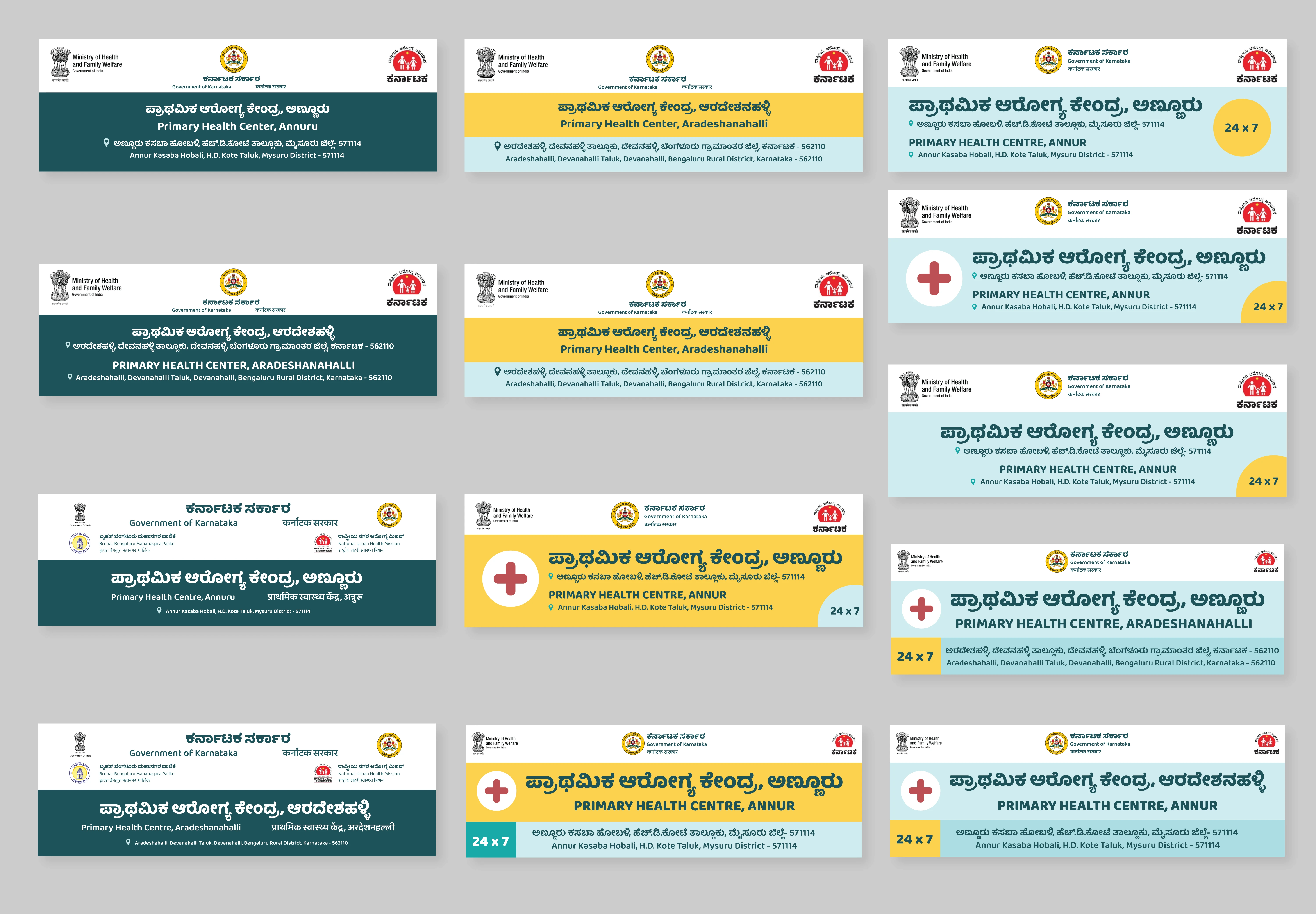
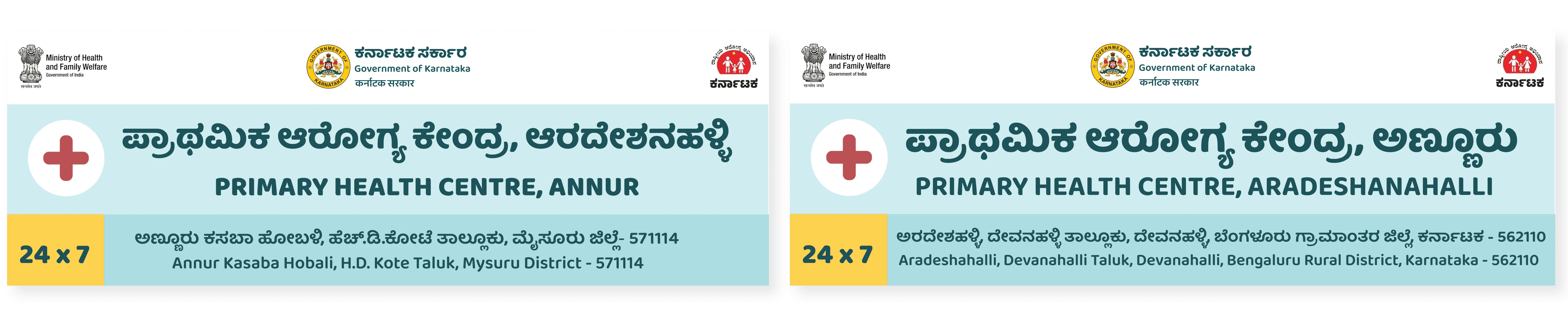
Entrance signage at Annuru PHC, which was revisited and refined through the brand framework created
Entrance signage at Annuru PHC, which was revisited and refined through the brand framework created
Entrance signage at Annuru PHC, which was revisited and refined through the brand framework created

Iterations and explorations for the center lightboards with the brand language applied
Iterations and explorations for the center lightboards with the brand language applied
Iterations and explorations for the center lightboards with the brand language applied
Iterations and form explorations for the navigational floor stickers
Iterations and form explorations for the navigational floor stickers
Iterations and form explorations for the navigational floor stickers

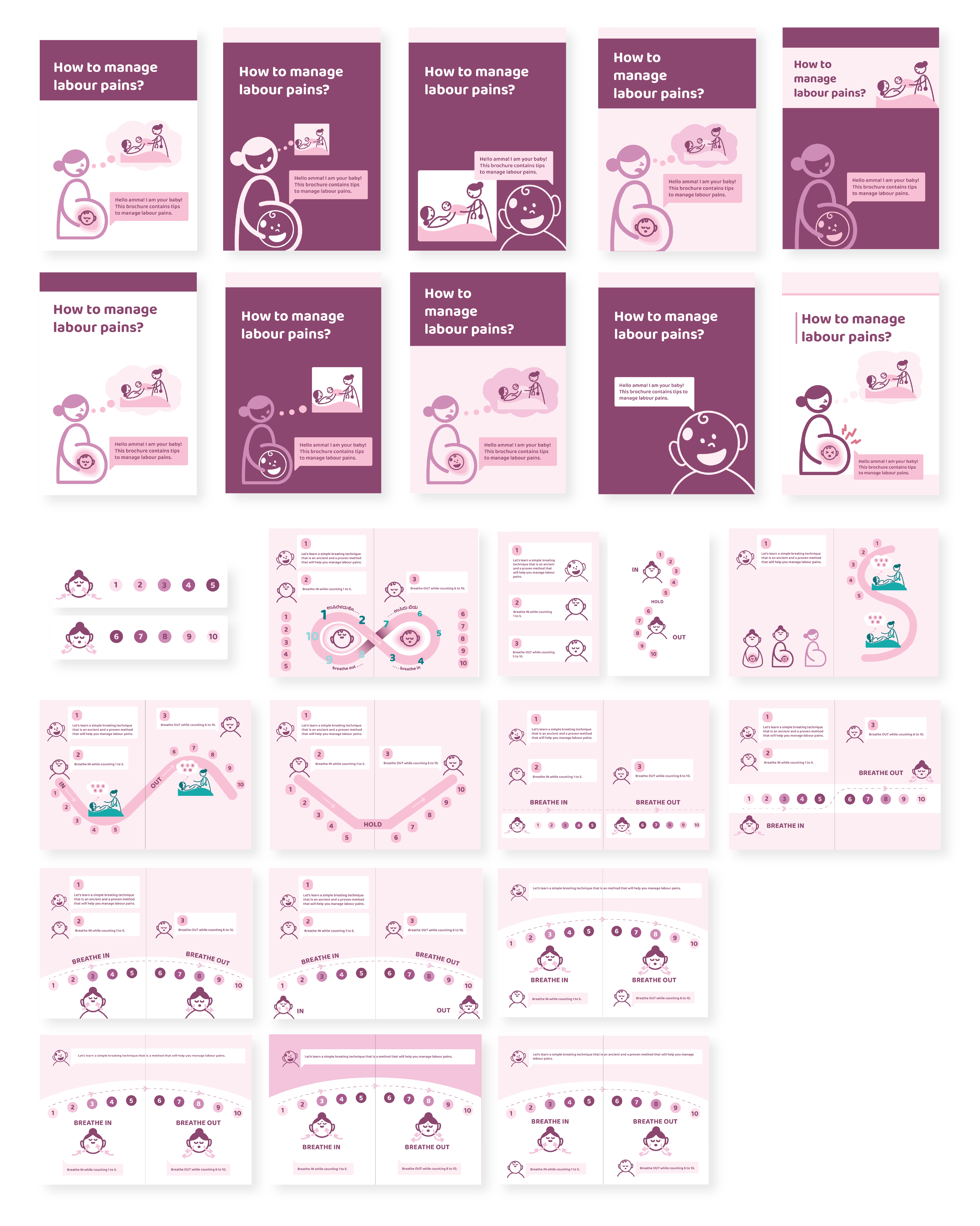
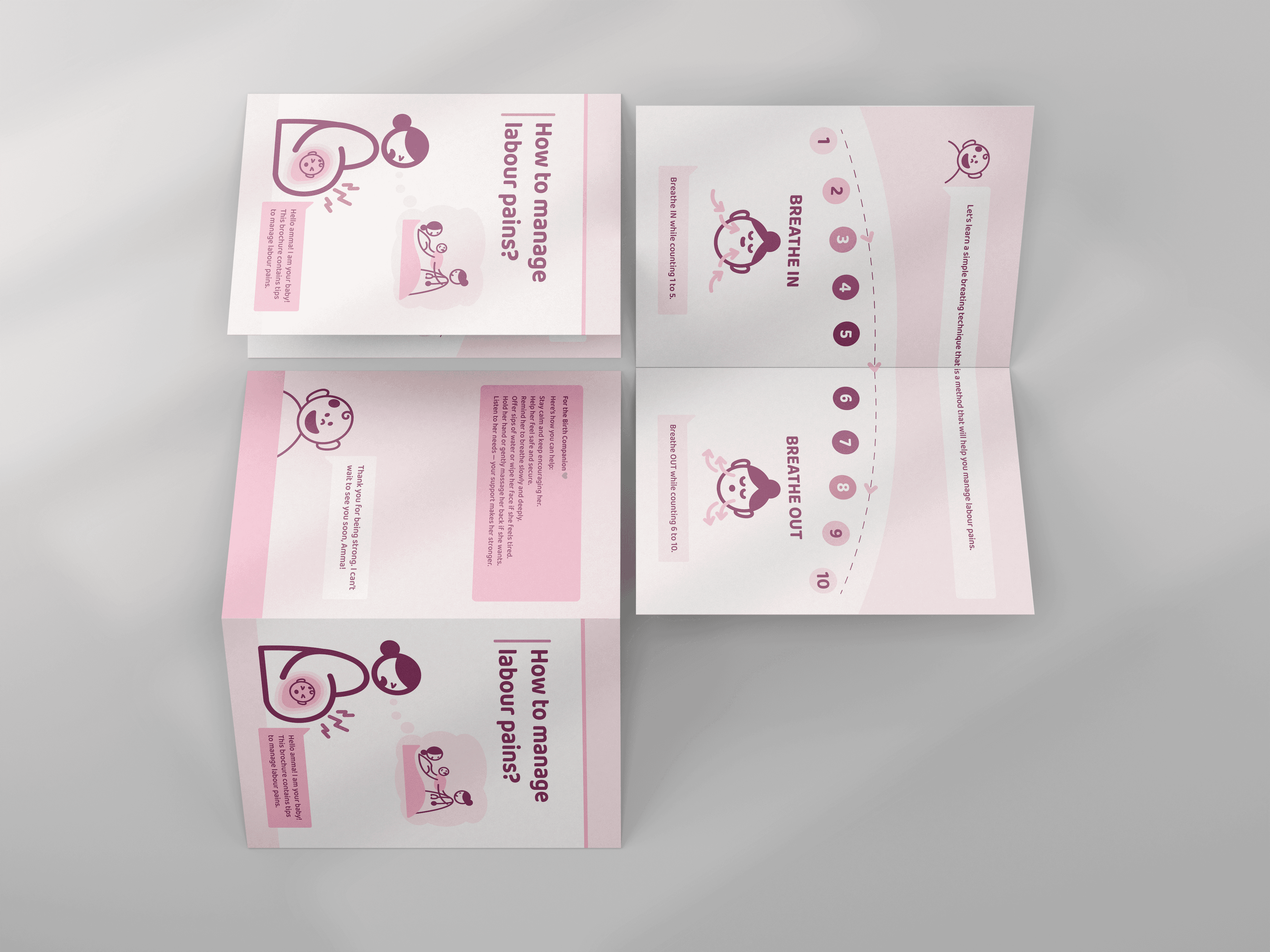
Iterations and explorations for the Labour Room Breathing handout
Iterations and explorations for the Labour Room Breathing handout
Iterations and explorations for the Labour Room Breathing handout
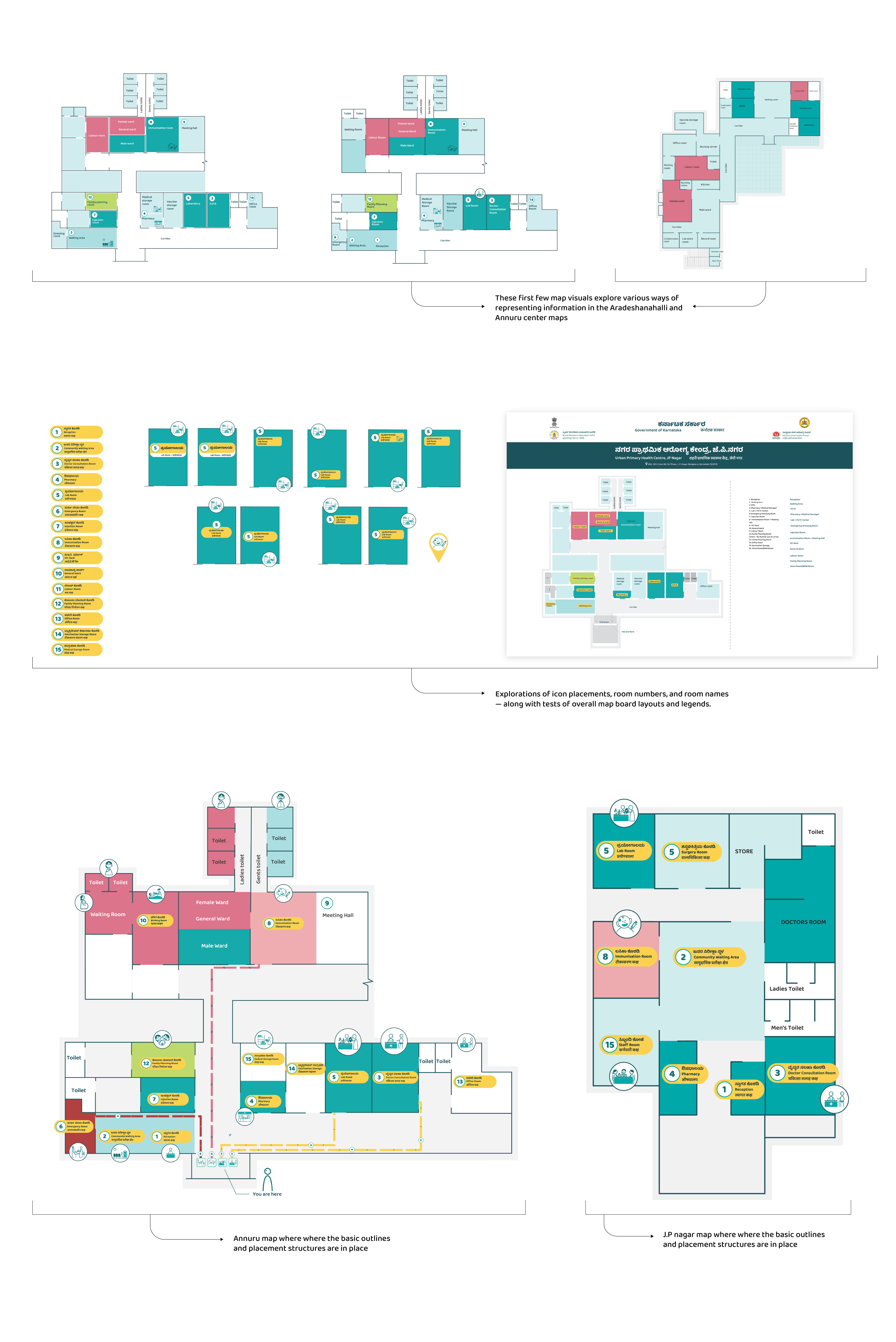
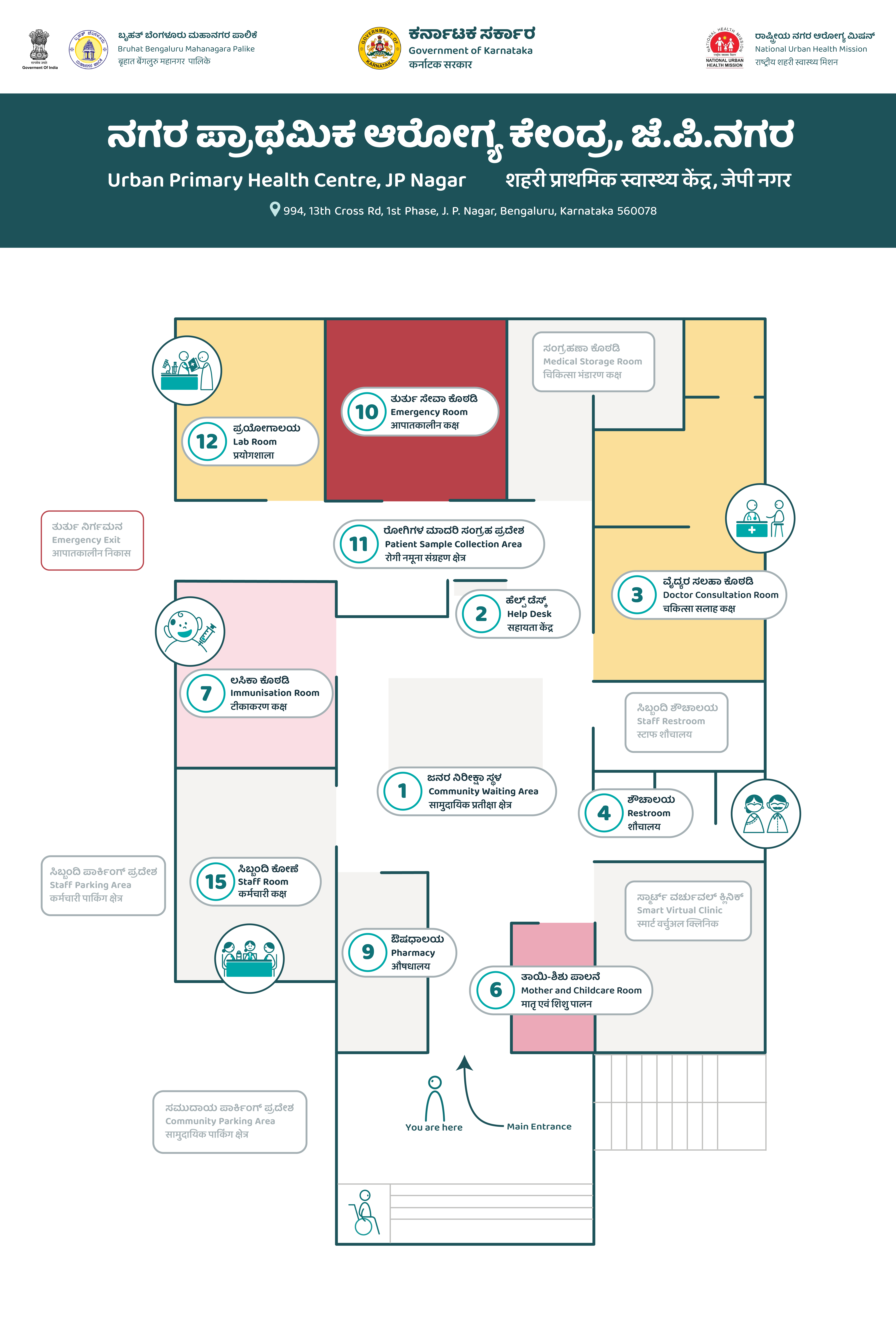
Iterations and explorations for the center map to be placed at entrance for easy navigation
Iterations and explorations for the center map to be placed at entrance for easy navigation
Iterations and explorations for the center map to be placed at entrance for easy navigation
Final Collateral Development & Preparation for Testing
Final versions of the collaterals were approved via online feedback for the second round of testing.
These finalized materials — including door and floor stickers, priority seating markers, lightboards, labor handouts, breastfeeding and the accordion-style family planning kit, were prepared for printing and further testing in the PHC environment.
Final Collateral Development & Preparation for Testing
Final versions of the collaterals were approved via online feedback for the second round of testing.
These finalized materials — including door and floor stickers, priority seating markers, lightboards, labor handouts, breastfeeding and the accordion-style family planning kit, were prepared for printing and further testing in the PHC environment.
Final Collateral Development & Preparation for Testing
Final versions of the collaterals were approved via online feedback for the second round of testing.
These finalized materials — including door and floor stickers, priority seating markers, lightboards, labor handouts, breastfeeding and the accordion-style family planning kit, were prepared for printing and further testing in the PHC environment.
Refined and approved version of the door sticker, ready for testing
Refined and approved version of the door sticker, ready for testing
Refined and approved version of the door sticker, ready for testing

Refined and approved version of the priority seating stickers, ready for testing
Refined and approved version of the priority seating stickers, ready for testing
Refined and approved version of the priority seating stickers, ready for testing

Refined and approved version of the floor sticker, ready for testing
Refined and approved version of the floor sticker, ready for testing
Refined and approved version of the floor sticker, ready for testing



Refined and approved version of the PHC lightboards, ready for testing
Refined and approved version of the PHC lightboards, ready for testing
Refined and approved version of the PHC lightboards, ready for testing
Refined and approved version of the labor room handout, ready for testing
Refined and approved version of the labor room handout, ready for testing
Refined and approved version of the labor room handout, ready for testing

Refined and approved version of the breastfeeding poster, ready for testing
Refined and approved version of the breastfeeding poster, ready for testing
Refined and approved version of the breastfeeding poster, ready for testing


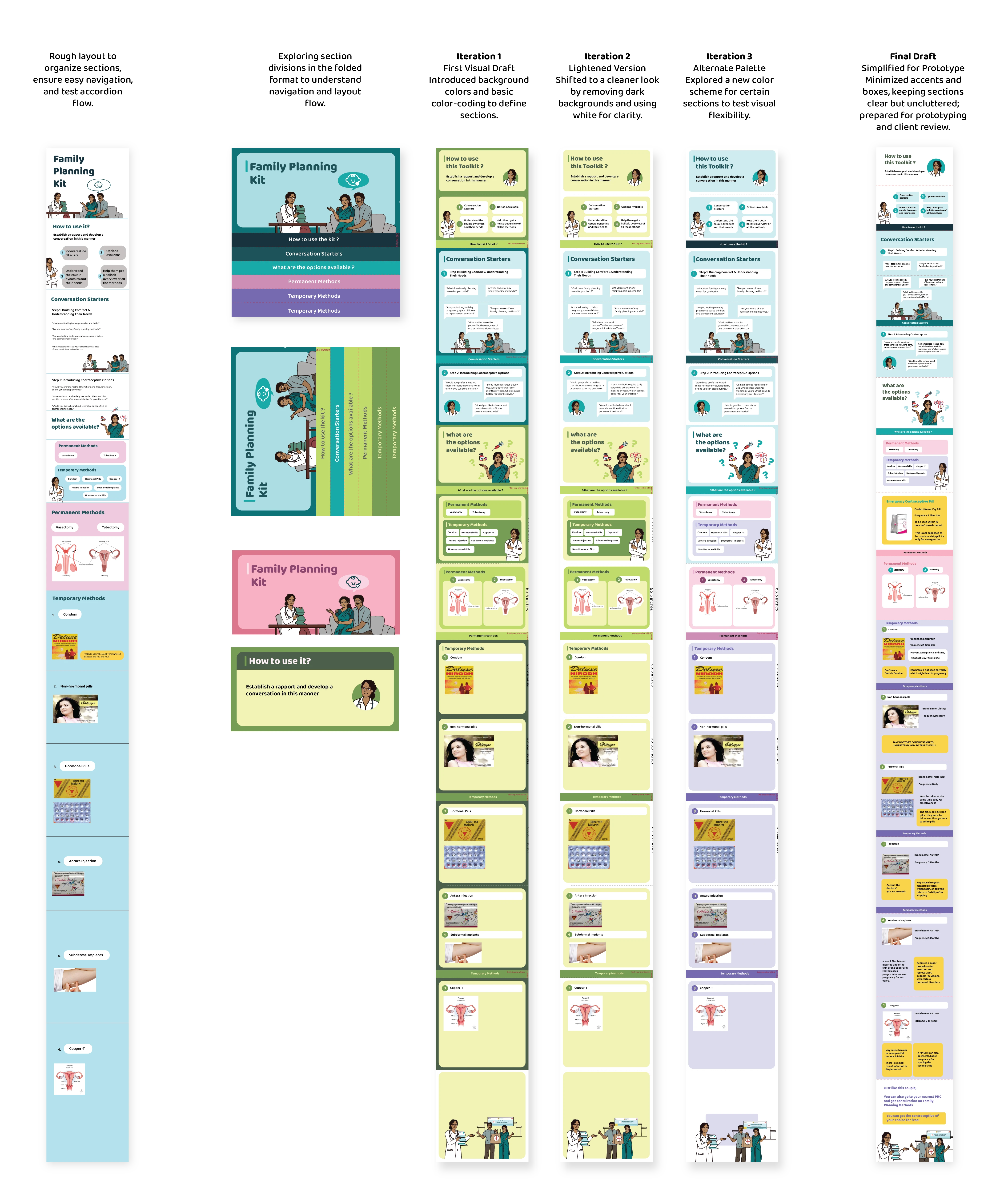
Explorations of the family planning kit and the final refined and approved version, ready for testing
Explorations of the family planning kit and the final refined and approved version, ready for testing
Explorations of the family planning kit and the final refined and approved version, ready for testing
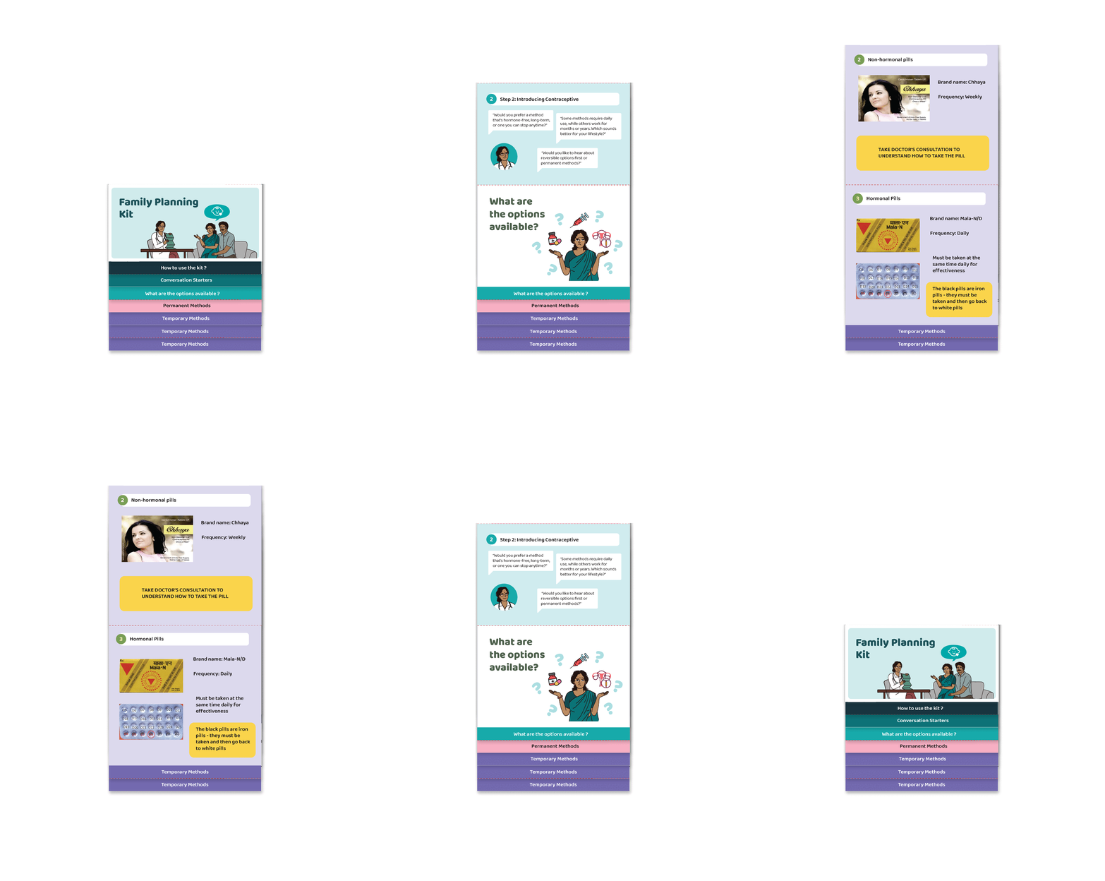
A moving image demonstrating the accordion-fold functionality of the family planning kit
A moving image demonstrating the accordion-fold functionality of the family planning kit
A moving image demonstrating the accordion-fold functionality of the family planning kit
Iteration and Feedback
Most of the feedback received from the on-ground team and the PHC staff was positive. The posters, handouts, and light board were well received, as were the navigational aids and stickers. The main concern was around the family planning accordion kit — specifically its long-term usability, flexibility, and material durability. These aspects were to be better understood through physical testing and potential future adaptations.
The center map also required major revisions as the interiors of the PHC were undergoing spatial changes, which meant the existing layout had to be paused and reworked. The team also discussed exploring ways to visually connect the map design more closely to the signage style used within the PHC. This was noted for further development by the next designer taking over the project.
Iteration and Feedback
Most of the feedback received from the on-ground team and the PHC staff was positive. The posters, handouts, and light board were well received, as were the navigational aids and stickers. The main concern was around the family planning accordion kit — specifically its long-term usability, flexibility, and material durability. These aspects were to be better understood through physical testing and potential future adaptations.
The center map also required major revisions as the interiors of the PHC were undergoing spatial changes, which meant the existing layout had to be paused and reworked. The team also discussed exploring ways to visually connect the map design more closely to the signage style used within the PHC. This was noted for further development by the next designer taking over the project.
Iteration and Feedback
Most of the feedback received from the on-ground team and the PHC staff was positive. The posters, handouts, and light board were well received, as were the navigational aids and stickers. The main concern was around the family planning accordion kit — specifically its long-term usability, flexibility, and material durability. These aspects were to be better understood through physical testing and potential future adaptations.
The center map also required major revisions as the interiors of the PHC were undergoing spatial changes, which meant the existing layout had to be paused and reworked. The team also discussed exploring ways to visually connect the map design more closely to the signage style used within the PHC. This was noted for further development by the next designer taking over the project.
Key Learnings & Future Improvements
Designing for a public space like a PHC requires careful attention to color, icons, and typography to maintain clarity and consistency
Regular prototyping is essential, as print outcomes often differ from on-screen visuals in scale and visibility
Inclusive design ensures accessibility across varying literacy and comprehension levels
Iterations combined with small user tests help refine usability and comprehension early on
Building on existing visual systems strengthens cohesion and adaptability for all collaterals created over time
Regional Language–First Design: Future iterations should prioritize designing in Kannada (or the local language) first, rather than translating after layout, to ensure better composition and readability due to differences in script density and flow
Alternate Format for Family Planning Kit: Exploring a bound or anchored version could make it easier to handle while preserving section-wise navigation
Simplifying the PHC Map: Future iterations could reduce visual clutter by emphasizing high-footfall areas and key navigation junctions instead of mapping every room in detail, streamlining wayfinding while maintaining clarity
Dynamic Color Frameworks: Creating a broader, adaptable color palette could make the system more contextually responsive across PHCs while retaining brand coherence
Key Learnings & Future Improvements
Designing for a public space like a PHC requires careful attention to color, icons, and typography to maintain clarity and consistency
Regular prototyping is essential, as print outcomes often differ from on-screen visuals in scale and visibility
Inclusive design ensures accessibility across varying literacy and comprehension levels
Iterations combined with small user tests help refine usability and comprehension early on
Building on existing visual systems strengthens cohesion and adaptability for all collaterals created over time
Regional Language–First Design: Future iterations should prioritize designing in Kannada (or the local language) first, rather than translating after layout, to ensure better composition and readability due to differences in script density and flow
Alternate Format for Family Planning Kit: Exploring a bound or anchored version could make it easier to handle while preserving section-wise navigation
Simplifying the PHC Map: Future iterations could reduce visual clutter by emphasizing high-footfall areas and key navigation junctions instead of mapping every room in detail, streamlining wayfinding while maintaining clarity
Dynamic Color Frameworks: Creating a broader, adaptable color palette could make the system more contextually responsive across PHCs while retaining brand coherence
Key Learnings & Future Improvements
Designing for a public space like a PHC requires careful attention to color, icons, and typography to maintain clarity and consistency
Regular prototyping is essential, as print outcomes often differ from on-screen visuals in scale and visibility
Inclusive design ensures accessibility across varying literacy and comprehension levels
Iterations combined with small user tests help refine usability and comprehension early on
Building on existing visual systems strengthens cohesion and adaptability for all collaterals created over time
Regional Language–First Design: Future iterations should prioritize designing in Kannada (or the local language) first, rather than translating after layout, to ensure better composition and readability due to differences in script density and flow
Alternate Format for Family Planning Kit: Exploring a bound or anchored version could make it easier to handle while preserving section-wise navigation
Simplifying the PHC Map: Future iterations could reduce visual clutter by emphasizing high-footfall areas and key navigation junctions instead of mapping every room in detail, streamlining wayfinding while maintaining clarity
Dynamic Color Frameworks: Creating a broader, adaptable color palette could make the system more contextually responsive across PHCs while retaining brand coherence
Not everything here's polished yet, but the heart of it is here :)
Thanks for visiting!
Not everything here's polished yet, but the heart of it is here :)
Thanks for visiting!