Impact assesment Report
Type: Client project (Maruti Suzuki)
Report Design | Data Visualization |Editorial Design | Visual Systems | CSR Communication | Publication Design
Designing Maruti Suzuki’s CSR Impact Report for the year 2024 to present data with clarity & credibility
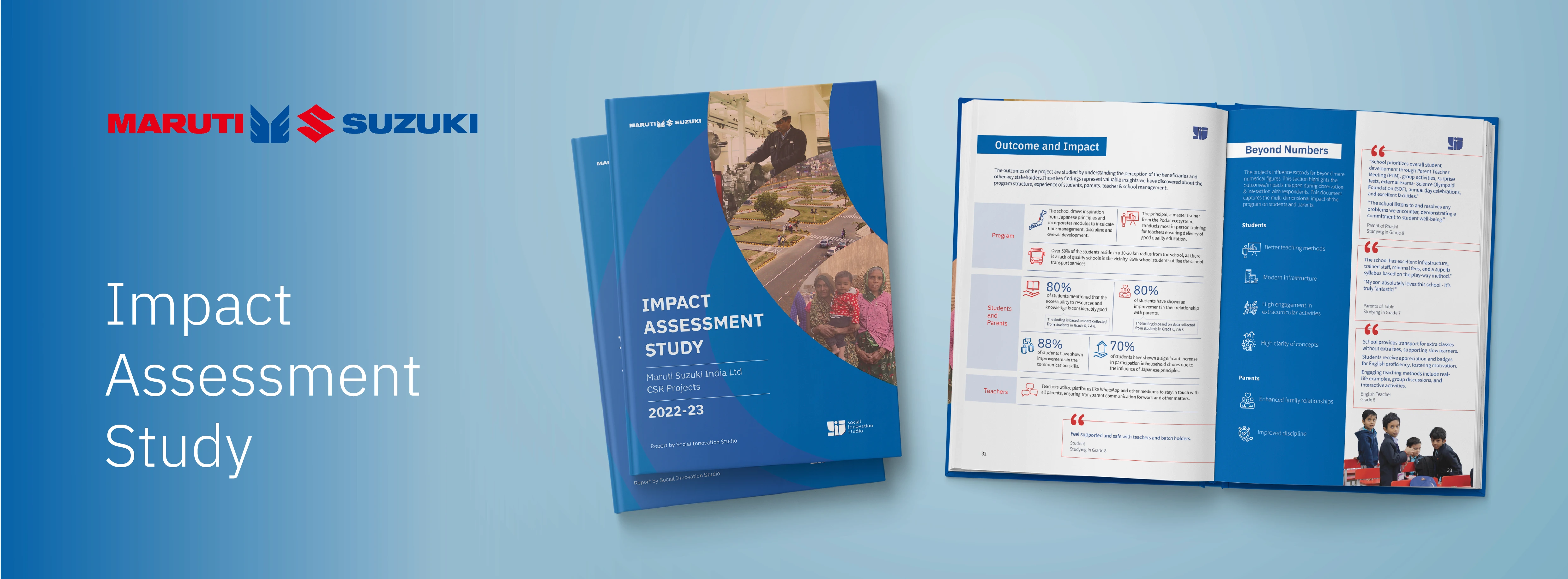
Each year, Maruti Suzuki undertakes multiple CSR programs across skill development, community development and road safety. This report aimed to visually translate the impact of these through a structured approach that feels both informative and meaningful.
Role: Lead Visual Designer (defined the overall visual system, explored and developed final layouts, and worked across content interpretation, visualization, and hierarchy)
Tools used : InDesign • Illustrator
Duration: 6 weeks (March'24)
Impact assesment Report
Type: Client project (Maruti Suzuki)
Report Design | Data Visualization |Editorial Design | Visual Systems | CSR Communication | Publication Design
Designing Maruti Suzuki’s CSR Impact Report for the year 2024 to present data with clarity & credibility
Each year, Maruti Suzuki undertakes multiple CSR programs across skill development, community development and road safety. This report aimed to visually translate the impact of these through a structured approach that feels both informative and meaningful.
Role: Lead Visual Designer (defined the overall visual system, explored and developed final layouts, and worked across content interpretation, visualization, and hierarchy)
Tools used : InDesign • Illustrator
Duration: 6 weeks (March'24)
Impact assesment Report
Type: Client project (Maruti Suzuki)
Report Design | Data Visualization |Editorial Design | Visual Systems | CSR Communication | Publication Design
Designing Maruti Suzuki’s CSR Impact Report for the year 2024 to present data with clarity & credibility
Each year, Maruti Suzuki undertakes multiple CSR programs across skill development, community development and road safety. This report aimed to visually translate the impact of these through a structured approach that feels both informative and meaningful.
Role: Lead Visual Designer (defined the overall visual system, explored and developed final layouts, and worked across content interpretation, visualization, and hierarchy)
Tools used : InDesign • Illustrator
Duration: 6 weeks (March'24)
Challenge
To convert the detailed accounts, statistics and data of Maruti Suzuki’s multiple CSR programs across road safety, skill development and community development programs, collected by the research team, into a into a cohesive report that communicates both numbers and stories effectively.
Challenge
To convert the detailed accounts, statistics and data of Maruti Suzuki’s multiple CSR programs across road safety, skill development and community development programs, collected by the research team, into a into a cohesive report that communicates both numbers and stories effectively.
Challenge
To convert the detailed accounts, statistics and data of Maruti Suzuki’s multiple CSR programs across road safety, skill development and community development programs, collected by the research team, into a into a cohesive report that communicates both numbers and stories effectively.
Analyzing Previous Reports
Before beginning the design process, we reviewed past CSR reports to understand their strengths and shortcomings. Key observations included:
Reports were heavily information-dense with minimal visuals
Lack of storytelling or narrative structure made key insights harder to grasp
Few to no photographs, testimonials, or other human elements
Unclear hierarchy and organization made navigation difficult
These insights helped define the areas for improvement and guided our approach to creating a more engaging, structured, and visually-driven report.
Analyzing Previous Reports
Before beginning the design process, we reviewed past CSR reports to understand their strengths and shortcomings. Key observations included:
Reports were heavily information-dense with minimal visuals
Lack of storytelling or narrative structure made key insights harder to grasp
Few to no photographs, testimonials, or other human elements
Unclear hierarchy and organization made navigation difficult
These insights helped define the areas for improvement and guided our approach to creating a more engaging, structured, and visually-driven report.
Analyzing Previous Reports
Before beginning the design process, we reviewed past CSR reports to understand their strengths and shortcomings. Key observations included:
Reports were heavily information-dense with minimal visuals
Lack of storytelling or narrative structure made key insights harder to grasp
Few to no photographs, testimonials, or other human elements
Unclear hierarchy and organization made navigation difficult
These insights helped define the areas for improvement and guided our approach to creating a more engaging, structured, and visually-driven report.
Visual references from earlier reports
Visual references from earlier reports

Key things to keep in mind
The report needed to speak to a formal audience while still feeling human. We aimed to strike a balance between professional layouts and storytelling by making the impact visible, memorable, and easy to understand without being overwhelming.
Key considerations:
Establish a consistent visual language across all sections
Maintain a clear narrative structure and hierarchy for every program
Ensure easy navigation and readability throughout
Highlight key insights and inferences from field research
Include relevant testimonials to represent diverse stakeholder perspectives
Key things to keep in mind
The report needed to speak to a formal audience while still feeling human. We aimed to strike a balance between professional layouts and storytelling by making the impact visible, memorable, and easy to understand without being overwhelming.
Key considerations:
Establish a consistent visual language across all sections
Maintain a clear narrative structure and hierarchy for every program
Ensure easy navigation and readability throughout
Highlight key insights and inferences from field research
Include relevant testimonials to represent diverse stakeholder perspectives
Key things to keep in mind
The report needed to speak to a formal audience while still feeling human. We aimed to strike a balance between professional layouts and storytelling by making the impact visible, memorable, and easy to understand without being overwhelming.
Key considerations:
Establish a consistent visual language across all sections
Maintain a clear narrative structure and hierarchy for every program
Ensure easy navigation and readability throughout
Highlight key insights and inferences from field research
Include relevant testimonials to represent diverse stakeholder perspectives
Ideation and Process
Before jumping into visuals, I worked with the team’s communication lead to understand the mapped out content and it’s structure. We then worked on visually categorizing the data, grouping broader themes, main pages and overall layout hierarchy and drafted a framework that could work across chapters and formats.
The next step was to define the visual language. I developed a basic brand system for the report, outlining guidelines and pointers for:
Typeface
Colour palette
Icons, maps, tables, and heading styles
Data representation formats
Photo treatments
Ideation and Process
Before jumping into visuals, I worked with the team’s communication lead to understand the mapped out content and it’s structure. We then worked on visually categorizing the data, grouping broader themes, main pages and overall layout hierarchy and drafted a framework that could work across chapters and formats.
The next step was to define the visual language. I developed a basic brand system for the report, outlining guidelines and pointers for:
Typeface
Colour palette
Icons, maps, tables, and heading styles
Data representation formats
Photo treatments
Ideation and Process
Before jumping into visuals, I worked with the team’s communication lead to understand the mapped out content and it’s structure. We then worked on visually categorizing the data, grouping broader themes, main pages and overall layout hierarchy and drafted a framework that could work across chapters and formats.
The next step was to define the visual language. I developed a basic brand system for the report, outlining guidelines and pointers for:
Typeface
Colour palette
Icons, maps, tables, and heading styles
Data representation formats
Photo treatments
A few early explorations and iterations that helped define the visual system

Final visual guidelines for the report
Final visual guidelines for the report
Final visual guidelines for the report


Once the visual system was in place, multiple rough layout iterations were created and explored for:
Chapter intros
Program summaries
Success stories
Key stats and visuals
These explorations helped arrive at cohesive layouts for the divider and highlight sections.
Once the visual system was in place, multiple rough layout iterations were created and explored for:
Chapter intros
Program summaries
Success stories
Key stats and visuals
These explorations helped arrive at cohesive layouts for the divider and highlight sections.
Once the visual system was in place, multiple rough layout iterations were created and explored for:
Chapter intros
Program summaries
Success stories
Key stats and visuals
These explorations helped arrive at cohesive layouts for the divider and highlight sections.
Some of the early layout explorations across various sections
Some of the early layout explorations across various sections
Some of the early layout explorations across various sections

Design Exploration
After analyzing the older reports and incorporating those insights, and once the section layouts, structures, visuals, and copywriting were finalized, the next step was to adapt the layouts to the finalised content. Each layout was refined to suit the program-specific context and evolving content needs. This process required multiple drafts, as both content and visualizations were iterated several times.
Design Exploration
After analyzing the older reports and incorporating those insights, and once the section layouts, structures, visuals, and copywriting were finalized, the next step was to adapt the layouts to the finalised content. Each layout was refined to suit the program-specific context and evolving content needs. This process required multiple drafts, as both content and visualizations were iterated several times.
Design Exploration
After analyzing the older reports and incorporating those insights, and once the section layouts, structures, visuals, and copywriting were finalized, the next step was to adapt the layouts to the finalised content. Each layout was refined to suit the program-specific context and evolving content needs. This process required multiple drafts, as both content and visualizations were iterated several times.
Here’s a glimpse of how various data- and information-heavy sections were visualized for better clarity and ease of understanding. Most spreads went through multiple iterations as the content evolved and changed over time.
Here’s a glimpse of how various data- and information-heavy sections were visualized for better clarity and ease of understanding. Most spreads went through multiple iterations as the content evolved and changed over time.
Here’s a glimpse of how various data- and information-heavy sections were visualized for better clarity and ease of understanding. Most spreads went through multiple iterations as the content evolved and changed over time.

Cover page explorations
Cover page explorations
Cover page explorations

Documenting Impact stories
Alongside the main report, a companion Success Stories booklet was created to document impact stories from the field. Simple illustrations were used to preserve stakeholder anonymity while representing their experiences and highlighting their actual testimonies.
Documenting Impact stories
Alongside the main report, a companion Success Stories booklet was created to document impact stories from the field. Simple illustrations were used to preserve stakeholder anonymity while representing their experiences and highlighting their actual testimonies.
Documenting Impact stories
Alongside the main report, a companion Success Stories booklet was created to document impact stories from the field. Simple illustrations were used to preserve stakeholder anonymity while representing their experiences and highlighting their actual testimonies.

Spreads from The success stories booklet
Spreads from The success stories booklet
Spreads from The success stories booklet

Iteration and Feedback
Feedback from the client revolved majorly around clarity around the content , and representation hierarchy and language of the statistical data and findings from the field.
Multiple iterations were made in terms of the content changes, resulted in multiple layout and data visualising changes.
Most iterations were around adapting to evolving content.
We built the report program section-wise, with feedback cycles focused on clarity, consistency, and making space for the stories within the data.
Iteration and Feedback
Feedback from the client revolved majorly around clarity around the content , and representation hierarchy and language of the statistical data and findings from the field.
Multiple iterations were made in terms of the content changes, resulted in multiple layout and data visualising changes.
Most iterations were around adapting to evolving content.
We built the report program section-wise, with feedback cycles focused on clarity, consistency, and making space for the stories within the data.
Iteration and Feedback
Feedback from the client revolved majorly around clarity around the content , and representation hierarchy and language of the statistical data and findings from the field.
Multiple iterations were made in terms of the content changes, resulted in multiple layout and data visualising changes.
Most iterations were around adapting to evolving content.
We built the report program section-wise, with feedback cycles focused on clarity, consistency, and making space for the stories within the data.
Solution
After multiple rounds of iteration, including over 150 layout explorations and more than five feedback cycles, the final report was curated to streamline content and visuals effectively.
Solution
After multiple rounds of iteration, including over 150 layout explorations and more than five feedback cycles, the final report was curated to streamline content and visuals effectively.
Solution
After multiple rounds of iteration, including over 150 layout explorations and more than five feedback cycles, the final report was curated to streamline content and visuals effectively.
Final Spreads of the Impact Assesment Report
Final Spreads of the Impact Assesment Report
Final Spreads of the Impact Assesment Report

As the final Outcome we delivered:
An 80+ page annual CSR report, ready for print and digital circulation
A separate Success Stories booklet featuring personal narratives of impact
A flexible visual system adaptable for future reports
As the final Outcome we delivered:
An 80+ page annual CSR report, ready for print and digital circulation
A separate Success Stories booklet featuring personal narratives of impact
A flexible visual system adaptable for future reports
As the final Outcome we delivered:
An 80+ page annual CSR report, ready for print and digital circulation
A separate Success Stories booklet featuring personal narratives of impact
A flexible visual system adaptable for future reports
Impact and Results
What Worked:
A clear editorial structure reduced visual and structural overwhelm, unlike earlier information-heavy reports that lacked a cohesive narrative flow.
Strong visuals balanced the content-heavy pages and improved overall readability.
The layout maintained consistency and adaptability even as the content evolved.
Navigation throughout the report was significantly improved compared to previous impact reports.
The additional booklet created space for more stories from the field, allowing their impact to be conveyed in a more personal and human way beyond the formal tone of the main report.
What I Would Do Differently
If I had more time, I’d:
Explore more visual forms of data narration and visualization
Lock in content earlier to reduce unnecessary rework
Find better ways to help the client visualize early layouts without needing fully polished versions, saving production time
Impact and Results
What Worked:
A clear editorial structure reduced visual and structural overwhelm, unlike earlier information-heavy reports that lacked a cohesive narrative flow.
Strong visuals balanced the content-heavy pages and improved overall readability.
The layout maintained consistency and adaptability even as the content evolved.
Navigation throughout the report was significantly improved compared to previous impact reports.
The additional booklet created space for more stories from the field, allowing their impact to be conveyed in a more personal and human way beyond the formal tone of the main report.
What I Would Do Differently
If I had more time, I’d:
Explore more visual forms of data narration and visualization
Lock in content earlier to reduce unnecessary rework
Find better ways to help the client visualize early layouts without needing fully polished versions, saving production time
Impact and Results
What Worked:
A clear editorial structure reduced visual and structural overwhelm, unlike earlier information-heavy reports that lacked a cohesive narrative flow.
Strong visuals balanced the content-heavy pages and improved overall readability.
The layout maintained consistency and adaptability even as the content evolved.
Navigation throughout the report was significantly improved compared to previous impact reports.
The additional booklet created space for more stories from the field, allowing their impact to be conveyed in a more personal and human way beyond the formal tone of the main report.
What I Would Do Differently
If I had more time, I’d:
Explore more visual forms of data narration and visualization
Lock in content earlier to reduce unnecessary rework
Find better ways to help the client visualize early layouts without needing fully polished versions, saving production time
Key Learnings & Future Improvements
Content clarity comes first; everything else follows
Reports can evolve to tell human stories more empathetically, with less information overload and a more balanced structure between data and narrative
Framing impact visually helps build credibility and trust
Key Learnings & Future Improvements
Content clarity comes first; everything else follows
Reports can evolve to tell human stories more empathetically, with less information overload and a more balanced structure between data and narrative
Framing impact visually helps build credibility and trust
Key Learnings & Future Improvements
Content clarity comes first; everything else follows
Reports can evolve to tell human stories more empathetically, with less information overload and a more balanced structure between data and narrative
Framing impact visually helps build credibility and trust
Not everything here's polished yet, but the heart of it is here :)
Thanks for visiting!
Not everything here's polished yet, but the heart of it is here :)
Thanks for visiting!
Not everything here's polished yet, but the heart of it is here :)
Thanks for visiting!